M.A.D. Shoppe
Before TikTok Shop existed, I was designing what it would become
the setup
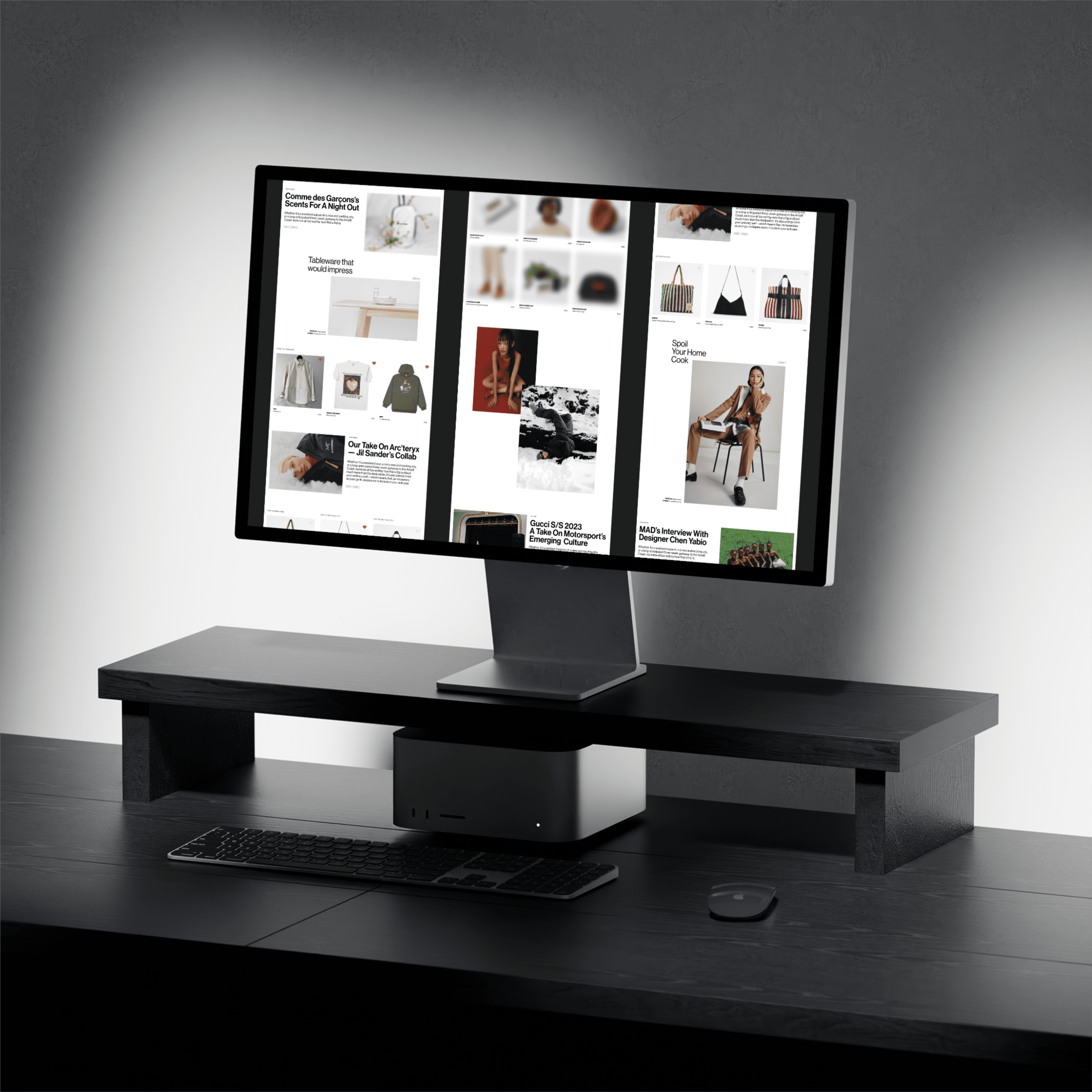
The M.A.D. Festival was a genuine cultural moment for emerging Québec and Canadian fashion - avant-garde, independent, alive. But when the festival ended, so did the visibility. Small brands packed up their pop-ups and went back to being unknown outside their immediate circles.
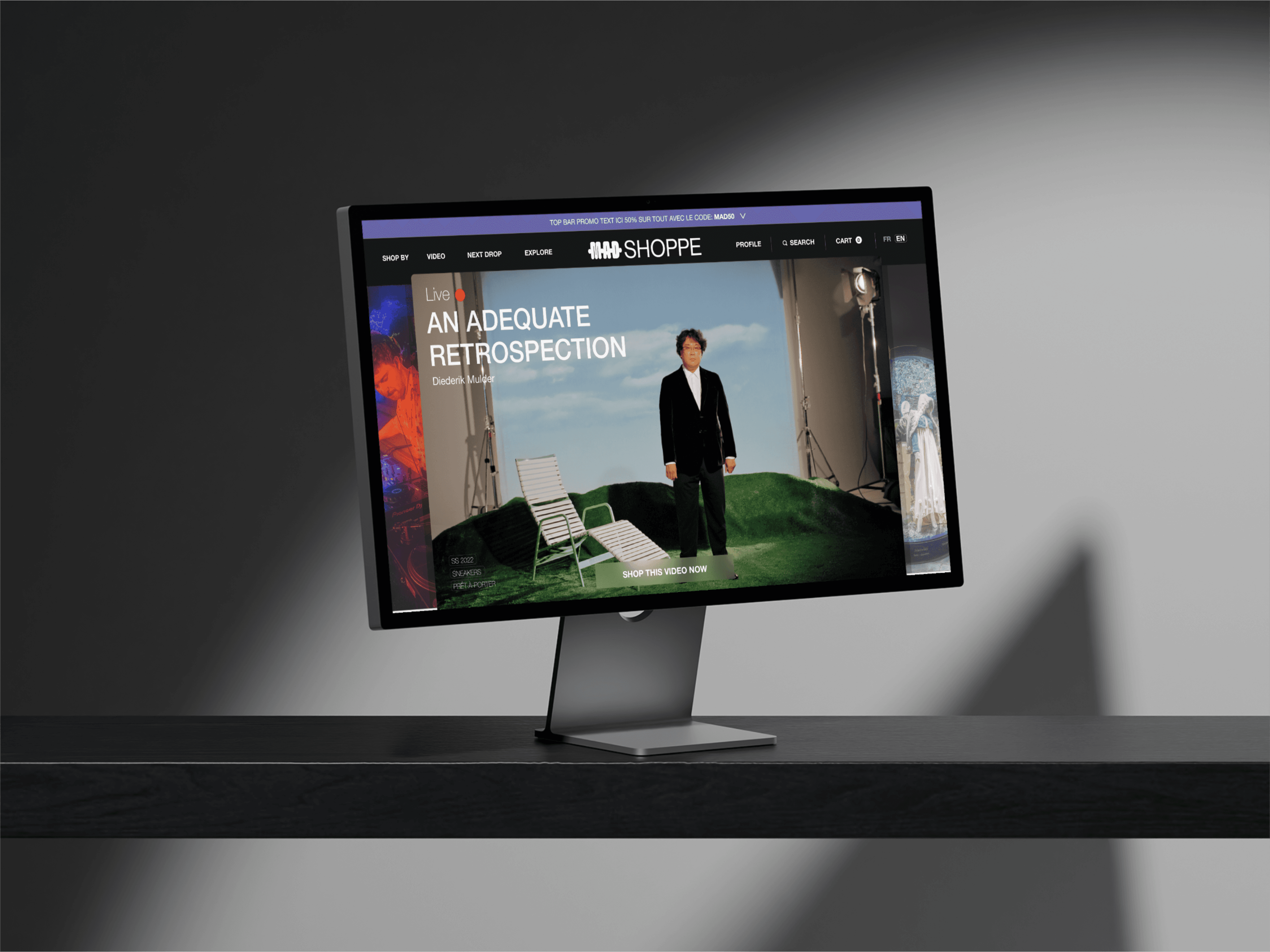
M.A.D. wanted to change that. The idea was M.A.D. Shoppe - a limited-time digital platform designed to extend the energy of the festival's physical marketplace online, giving independent brands a space to showcase and sell their collections to a wider audience during the festival window. The brief was e-commerce. The real opportunity was something more interesting: what does fashion commerce look like when it's built around culture rather than conversion?
what i found
There was no formal research phase - the contract scope didn't allow for it, and the timeline was two months from concept to launch. What I had instead was a clear read on the landscape and a stakeholder who knew their audience intimately.
Secondary research across fashion, editorial, and marketplace platforms surfaced a tension that the existing market hadn't resolved: fashion discovery is emotional and deeply visual, but the moment someone decides to buy, they need the experience to behave predictably. Editorial sites inspired desire but rarely converted. E-commerce sites converted but killed the mood getting there.
The bigger insight was behavioural. Users of a platform like this would move between two completely different modes - passive browsing that felt like reading a magazine, and intent-driven shopping focused on finding and buying a specific product. Most platforms forced a choice between the two. The opportunity was to support both without making either feel like a compromise.
what i did about it
The core decision was to anchor the experience in a magazine-inspired layout while treating accessibility and usability as the creative framework, not a constraint imposed on top of it. That distinction mattered because the visual direction coming from the graphic designer was bold - built for physical media, high contrast, typographically aggressive. Left unchecked it would have produced something beautiful and unusable.
I pushed back on typography choices that hurt readability at scale, and used animation deliberately to communicate hierarchy and flow rather than as decoration. The checkout experience stayed conventional on purpose - once a user shifted from browsing mode to buying mode, the last thing they needed was editorial friction between them and completing a purchase.
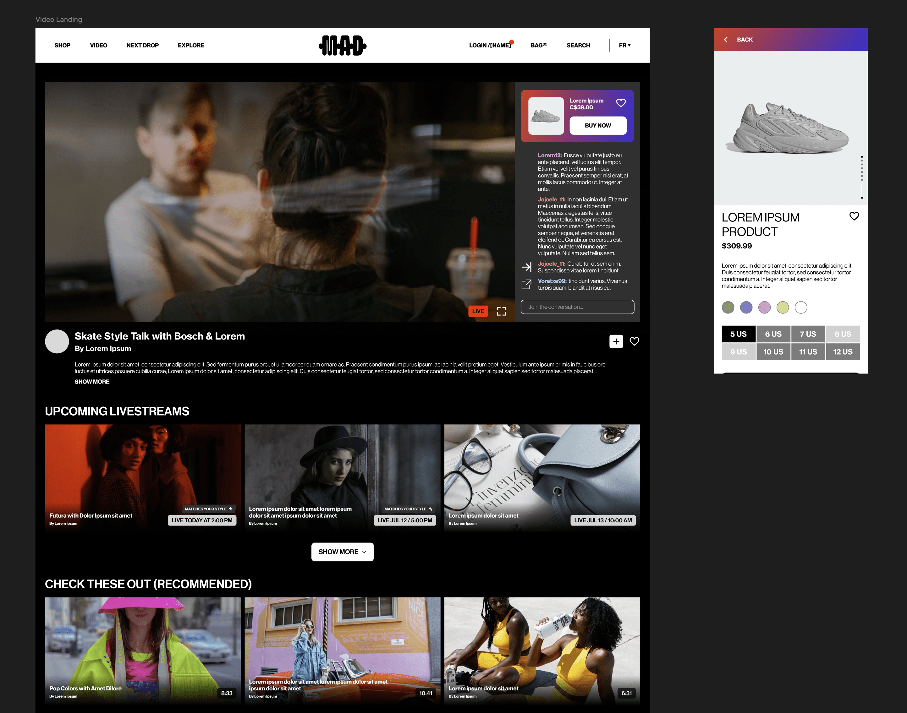
The other significant call was the livestream commerce integration. At the time there was no mainstream reference point for what shoppable livestreaming looked like - TikTok Shop didn't exist yet, YouTube Shopping wasn't a thing. I worked out the interaction from first principles: a live video surface with persistent chat, a product overlay triggered mid-stream, and a purchase flow that kept people in the live experience. Across the festival window, the feature converted at 3.4%.
[Process artifact: site architecture diagram or livestream interaction wireframe]
what it took
The collaboration dynamic on this project was unusual. As the only UX designer on the project, I was working alongside one graphic designer whose instincts came entirely from physical media - print, editorial, campaign work. That's a genuinely different visual language, and the gap between what looks right on a printed page and what works on a screen is significant.
Navigating that required holding the line on UX fundamentals without dismissing the visual ambition. When typography was too small to be accessible, I said so and offered an alternative that preserved the aesthetic intent. When layout density created hierarchy problems, I used animated prototypes to demonstrate the issue rather than arguing about it in the abstract. The prototypes became the shared language between us - something the stakeholder could react to and the graphic designer could see in motion rather than on a static frame.
The timeline left no room for iteration cycles. Everything had to be right enough on the first pass to move forward, which meant being decisive about what mattered and letting go of what didn't.
what it became
M.A.D. Shoppe launched for the festival period with 120+ vendors and 1,300+ items listed, and supported real commerce for independent brands that had never had a digital sales channel before.
The client came back for post-launch animation assets for a multi-week TV ad campaign with an estimated 2 to 3 million reach, a return with budget that said more than any single metric.
What the timeline also revealed in retrospect: the livestream commerce model I designed in 2022 as a speculative feature became one of the dominant formats in social commerce within the following two years. TikTok Shop launched broadly in 2023. YouTube Shopping followed. The interaction patterns we mapped from first principles turned out to be directionally right - just early.