
2025
Direct Energy Canada App
Utilities aren’t exciting. But access, clarity, and trust matter when it’s an essential service.
Overview
I led the design of Direct Energy Canada’s first-ever mobile app.
Where people’s experience was mostly just limited to logging in once-a-month to pay their bills, I saw an opportunity to bring customer value, build trust for the brand, and create a more relationship-driven experience.
Even internally (naturally) It started as skepticism “why would anyone need a utilities app?” Today it provides value in simplifying handling multiple logins, creating an easy to understand sign-up flow (in Alberta’s complex market). And provide a new way to gain insights on their usage without the availability of smart meters.
I focused on delivering customer value while ensuring alignment with our business goals. The app launched without marketing and gained 15,000+ organic downloads in its first month. It eliminated our login issues, and delivered a highly-requested feature that gave insight into people's energy usage. The app also garnered great reviews, holding a 5.0 App Store rating as of Jan 2026.
Overview
I led the design of Direct Energy Canada’s first-ever mobile app.
Where people’s experience was mostly just limited to logging in once-a-month to pay their bills, I saw an opportunity to bring customer value, build trust for the brand, and create a more relationship-driven experience.
Even internally (naturally) It started as skepticism “why would anyone need a utilities app?” Today it provides value in simplifying handling multiple logins, creating an easy to understand sign-up flow (in Alberta’s complex market). And provide a new way to gain insights on their usage without the availability of smart meters.
I focused on delivering customer value while ensuring alignment with our business goals. The app launched without marketing and gained 15,000+ organic downloads in its first month. It eliminated our login issues, and delivered a highly-requested feature that gave insight into people's energy usage. The app also garnered great reviews, holding a 5.0 App Store rating as of Jan 2026.

Conducting User Experience Research (UXR) was important to making this app land with our users. We conducted 9 user interviews to understand the types of customers that visit our online account management platform.
Synthesizing the interview with empathy maps we found there were 3 kinds of users that ranged on a spectrum of "aloof and carefree" to "anxious bill-checkers". With these personas we were able to mould our features to specifically target the sentiments of these varying users.

Conducting User Experience Research (UXR) was important to making this app land with our users. We conducted 9 user interviews to understand the types of customers that visit our online account management platform.
Synthesizing the interview with empathy maps we found there were 3 kinds of users that ranged on a spectrum of "aloof and carefree" to "anxious bill-checkers". With these personas we were able to mould our features to specifically target the sentiments of these varying users.
Context & Problem
“Oh wow I’m so excited to open my utilities app!” - said no one ever.
How do you make something inherently boring, not boring? People log in once a month, pay a bill, and leave.
That’s one problem, but in Canada, the problems ran deeper:
Alberta has a regulated and a competitive energy model (government vs free market - customer’s choice!). Each have their own nuances that can be confusing even for us employees, let alone a regular person.
Energy bills contain so many charges that it feels like companies are just out to swindle the customer (yet Direct Energy charges only equate to ~30% of the total bill).
You got regulated natural gas and competitive electricity in your home? Surprise! Now juggle remembering two logins (such lovely UX! *sarcasm of course*)
On top of that, brand trust had to be regained because of a US–Canada system integration causing widespread login failures, forced password resets, and overloaded call centres. Net Promoter Score (NPS) wasn't great to say the least.
This app was that ticket to rebuild everything from the ground up, with a strong focus on value for the customer, better education around their energy bills and an experience that rewards our customers rather than asking to cough up money.
Context & Problem
“Oh wow I’m so excited to open my utilities app!” - said no one ever.
How do you make something inherently boring, not boring? People log in once a month, pay a bill, and leave.
That’s one problem, but in Canada, the problems ran deeper:
Alberta has a regulated and a competitive energy model (government vs free market - customer’s choice!). Each have their own nuances that can be confusing even for us employees, let alone a regular person.
Energy bills contain so many charges that it feels like companies are just out to swindle the customer (yet Direct Energy charges only equate to ~30% of the total bill).
You got regulated natural gas and competitive electricity in your home? Surprise! Now juggle remembering two logins (such lovely UX! *sarcasm of course*)
On top of that, brand trust had to be regained because of a US–Canada system integration causing widespread login failures, forced password resets, and overloaded call centres. Net Promoter Score (NPS) wasn't great to say the least.
This app was that ticket to rebuild everything from the ground up, with a strong focus on value for the customer, better education around their energy bills and an experience that rewards our customers rather than asking to cough up money.
With two sides of the business, one being heavily regulated, our app had to ensure that the experiences offered to our customers both solved real problems creatively and was in line with regulatory constraints.
I created this comparison table to break down the parity of features between the two versions of the app and to communicate the variated experiences to stakeholders.

With two sides of the business, one being heavily regulated, our app had to ensure that the experiences offered to our customers both solved real problems creatively and was in line with regulatory constraints.
I created this comparison table to break down the parity of features between the two versions of the app and to communicate the variated experiences to stakeholders.


Having a defined process is key to success. I created this flow diagram before the design work began and held a session to align all stakeholders on our process of design output.
From my past experiences in delivering other projects at this company, I wanted to optimize the process of iteration and hand-off so that all the appropriate stakeholders were engaged at the right times to ensure a smooth flow.
While expecting 100% compliance is foolish, not having any process at all is even more foolish. Likewise, not everything went according to plan. Timely feedback from business stakeholders wasn't always the case. At times new edge-cases were discovered after completing design for a journey. Sometimes the Legal & Compliance team found further need for change after we iterated on their initial feedback. Such hiccups are a normal part of the process.
Despite that, I'm proud to say my team and I were able to deliver the design work one month in advance of expected timelines.

Having a defined process is key to success. I created this flow diagram before the design work began and held a session to align all stakeholders on our process of design output.
From my past experiences in delivering other projects at this company, I wanted to optimize the process of iteration and hand-off so that all the appropriate stakeholders were engaged at the right times to ensure a smooth flow.
While expecting 100% compliance is foolish, not having any process at all is even more foolish. Likewise, not everything went according to plan. Timely feedback from business stakeholders wasn't always the case. At times new edge-cases were discovered after completing design for a journey. Sometimes the Legal & Compliance team found further need for change after we iterated on their initial feedback. Such hiccups are a normal part of the process.
Despite that, I'm proud to say my team and I were able to deliver the design work one month in advance of expected timelines.
Role & Constraints
I took on a Lead Designer role from concept through launch.
Led end-to-end app design across all app journeys (35+)
Created sprint schedules and delivery plans, staying ahead of the dev team to ensure their sprints are filled with the next set of designs
Onboarded and led three contract designers and a newly hired in-house designer
Established clear ownership across complex journeys, trusting three designers with sprint-level responsibilities to deliver strong, independent work
Led internal design reviews, providing actionable feedback and to bring alignment on visual consistency
Ran cross-functional reviews with Product, Marketing, Legal, Compliance, Billing, Customer Care, and Engineering, while maintaining strict timelines on feedback delivery
Key constraints:
Creating varying experiences for the regulated and deregulated businesses (ie: a feature-packed vs simple experience)
Ensuring all designs were approved by legal and compliance stakeholders before dev hand-off
Design system had to be modified for a new shift in app styling
As the first app for Canada we had a lot to prove in hitting sales, engagement and retention metrics
Role & Constraints
I took on a Lead Designer role from concept through launch.
Led end-to-end app design across all app journeys (35+)
Created sprint schedules and delivery plans, staying ahead of the dev team to ensure their sprints are filled with the next set of designs
Onboarded and led three contract designers and a newly hired in-house designer
Established clear ownership across complex journeys, trusting three designers with sprint-level responsibilities to deliver strong, independent work
Led internal design reviews, providing actionable feedback and to bring alignment on visual consistency
Ran cross-functional reviews with Product, Marketing, Legal, Compliance, Billing, Customer Care, and Engineering, while maintaining strict timelines on feedback delivery
Key constraints:
Creating varying experiences for the regulated and deregulated businesses (ie: a feature-packed vs simple experience)
Ensuring all designs were approved by legal and compliance stakeholders before dev hand-off
Design system had to be modified for a new shift in app styling
As the first app for Canada we had a lot to prove in hitting sales, engagement and retention metrics
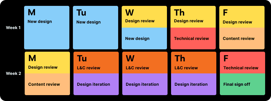
Equally as important as stakeholder process is to break down how we as designers output our work to high standards. To align with agile development teams on their two-week timelines, I broke down design, iteration and various stakeholder reviews in a two-week format as well to keep my team and I on track.
With this method I delegated out flows to the designers. Over time I paid attention to what kind of work each of the contract designers were attuned towards - design, prototyping, creative exploration, etc. and assigned tasks accordingly to their strengths.

Equally as important as stakeholder process is to break down how we as designers output our work to high standards. To align with agile development teams on their two-week timelines, I broke down design, iteration and various stakeholder reviews in a two-week format as well to keep my team and I on track.
With this method I delegated out flows to the designers. Over time I paid attention to what kind of work each of the contract designers were attuned towards - design, prototyping, creative exploration, etc. and assigned tasks accordingly to their strengths.

Key Insights
I integrated my prior user interview research along with our web analytics to help frame my approach:
50%+ of customers already managed utilities on mobile via the web
Customers noted having lack of clarity on their options in a regulated vs non regulated market
Bills felt confusing. Customers didn’t understand transmission, distribution, and government charges
Our charges were often less than a third of the total bill, but customers blamed us anyway
Login friction for an essential service felt unacceptable
The biggest insight:
Insights and bill understanding were more valuable than frequency of use.
Key Insights
I integrated my prior user interview research along with our web analytics to help frame my approach:
50%+ of customers already managed utilities on mobile via the web
Customers noted having lack of clarity on their options in a regulated vs non regulated market
Bills felt confusing. Customers didn’t understand transmission, distribution, and government charges
Our charges were often less than a third of the total bill, but customers blamed us anyway
Login friction for an essential service felt unacceptable
The biggest insight:
Insights and bill understanding were more valuable than frequency of use.

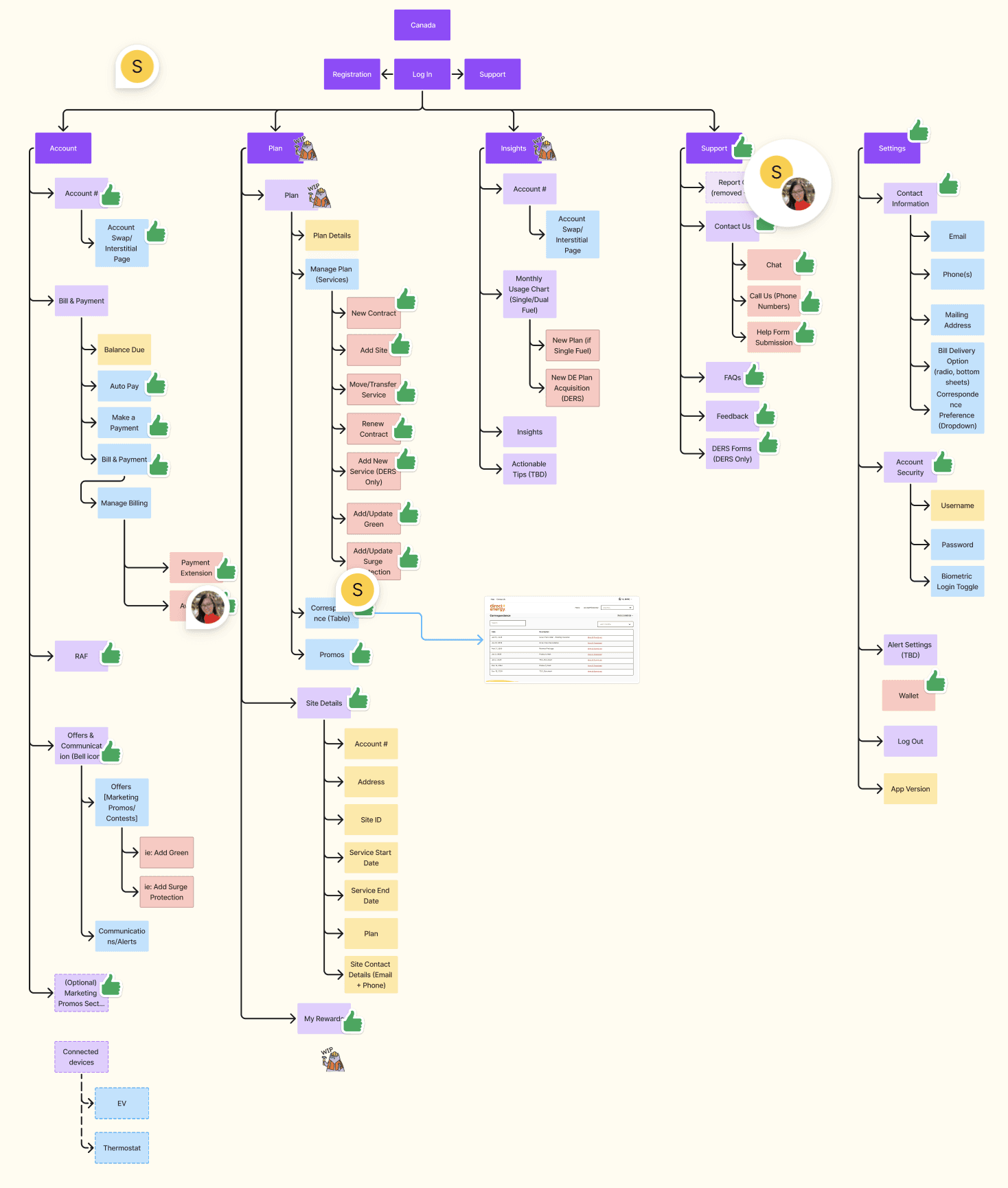
I created the app's architecture with one goal in mind. It has to be intuitive.
Our web login experience was definitely not optimized and was put together at at time when the term UX itself was uncommon and so this was an opportunity to bring ease of use and clear navigation through understanding mental models.
I performed card-sorting to group together the features that made sense to belong together. With grouping taken care of, next was the actual flows and flow navigation. You don't want your users navigating 4-5 levels down struggling to mentally understand where they are. Utilities are confusing enough as they are!
Apple has a video that they released on their WWDC22 keynote that speaks to navigation design in iOS. That became the grounding pillar. Things like when to hide the navigation bar, how many levels of navigation to have, how to group features based on mental models and not because "we want to market this feature so let's add it to the main tab." - so many golden nuggets in the video helped shaped the app with Apple's Human Interface Guidelines in mind.

I created the app's architecture with one goal in mind. It has to be intuitive.
Our web login experience was definitely not optimized and was put together at at time when the term UX itself was uncommon and so this was an opportunity to bring ease of use and clear navigation through understanding mental models.
I performed card-sorting to group together the features that made sense to belong together. With grouping taken care of, next was the actual flows and flow navigation. You don't want your users navigating 4-5 levels down struggling to mentally understand where they are. Utilities are confusing enough as they are!
Apple has a video that they released on their WWDC22 keynote that speaks to navigation design in iOS. That became the grounding pillar. Things like when to hide the navigation bar, how many levels of navigation to have, how to group features based on mental models and not because "we want to market this feature so let's add it to the main tab." - so many golden nuggets in the video helped shaped the app with Apple's Human Interface Guidelines in mind.


Decisions & Tradeoffs
Several decisions shaped the product:
Replaced passwords with biometric-first login to eliminate access friction
Prioritized account linking and multi-property management over secondary features
Designed bill breakdown feature to explain charges clearly, even when it made our role more visible
Introduced push notifications to help customers avoid late fees and warn of upcoming higher charges due to colder temperatures, despite low login frequency to maintain relevance and value for the customer
Accepted limited personalization at launch to hit timeline and stability goals
These choices traded feature breadth for trust, clarity, and reliability.
Decisions & Tradeoffs
Several decisions shaped the product:
Replaced passwords with biometric-first login to eliminate access friction
Prioritized account linking and multi-property management over secondary features
Designed bill breakdown feature to explain charges clearly, even when it made our role more visible
Introduced push notifications to help customers avoid late fees and warn of upcoming higher charges due to colder temperatures, despite low login frequency to maintain relevance and value for the customer
Accepted limited personalization at launch to hit timeline and stability goals
These choices traded feature breadth for trust, clarity, and reliability.
Defining our basics like font parameters was an important step in aiding our developers create a reference sheet of the various types of copy that would be used throughout the app.

Defining our basics like font parameters was an important step in aiding our developers create a reference sheet of the various types of copy that would be used throughout the app.

Execution Highlights
Rebuilt authentication to support Face ID / biometrics
Redesigned information architecture through card sorting and executed through sprint-based ownership
Introduced push notifications for billing and account updates
Created reusable patterns to support future OAM modernization
Implemented a brand new handoff flow to streamlined stakeholder feedback to avoid design limbo loops
Despite backtracking and requirement changes, the team delivered one month early.
Execution Highlights
Rebuilt authentication to support Face ID / biometrics
Redesigned information architecture through card sorting and executed through sprint-based ownership
Introduced push notifications for billing and account updates
Created reusable patterns to support future OAM modernization
Implemented a brand new handoff flow to streamlined stakeholder feedback to avoid design limbo loops
Despite backtracking and requirement changes, the team delivered one month early.

Apps are designed for various platforms. Understanding the nuances of interaction between Android and iOS was key to making a seamless experience regardless of platform. We created a reference page in Figma to provide developers reference of the slight design variations.

Apps are designed for various platforms. Understanding the nuances of interaction between Android and iOS was key to making a seamless experience regardless of platform. We created a reference page in Figma to provide developers reference of the slight design variations.
Outcomes
The launch was built on deliberate validation, not assumption. A pre-launch beta (Nov 2025, n=51) confirmed strong usability before public release — overall satisfaction averaged 4.4/5, with biometric login and bill comprehension emerging as the two highest-rated features.
Both were design decisions grounded in research. Bill comprehension came directly from user interviews exploring why people log in and what they actually do — the insight shaped a core part of the experience. Biometric login addressed a clear friction point in accessing an essential service, and verbally, users noticed.
In the first month post-launch (Dec 2025 – Jan 2026), the app reached ~15,000 organic downloads with no paid marketing. 87 sign-ups came through mobile — 57 net-new customers, 30 regulated-to-competitive transitions. Public ratings held at 5.0★ on iOS and 4.0★ on Android, consistent with beta findings.
The app became the first mobile acquisition channel across the NRG portfolio — validating mobile as a credible conversion surface at the enterprise level.
Outcomes
The launch was built on deliberate validation, not assumption. A pre-launch beta (Nov 2025, n=51) confirmed strong usability before public release — overall satisfaction averaged 4.4/5, with biometric login and bill comprehension emerging as the two highest-rated features.
Both were design decisions grounded in research. Bill comprehension came directly from user interviews exploring why people log in and what they actually do — the insight shaped a core part of the experience. Biometric login addressed a clear friction point in accessing an essential service, and verbally, users noticed.
In the first month post-launch (Dec 2025 – Jan 2026), the app reached ~15,000 organic downloads with no paid marketing. 87 sign-ups came through mobile — 57 net-new customers, 30 regulated-to-competitive transitions. Public ratings held at 5.0★ on iOS and 4.0★ on Android, consistent with beta findings.
The app became the first mobile acquisition channel across the NRG portfolio — validating mobile as a credible conversion surface at the enterprise level.
Organization of our Figma file was important in creating easy-to-follow user flows. Using a 'timeline view' format, a user would begin their journey at the left and end at the right. Screens that are stacked below the main happy path would be alternate branching paths, edge case scenarios as well as error states that could be experienced at that specific point in the journey.
This format allowed developers, business stakeholders and Legal & Compliance teams to easily interpret flows. It allowed Figma to became an easy to understand source-of-truth.

Organization of our Figma file was important in creating easy-to-follow user flows. Using a 'timeline view' format, a user would begin their journey at the left and end at the right. Screens that are stacked below the main happy path would be alternate branching paths, edge case scenarios as well as error states that could be experienced at that specific point in the journey.
This format allowed developers, business stakeholders and Legal & Compliance teams to easily interpret flows. It allowed Figma to became an easy to understand source-of-truth.

Reflection
This project reinforced the value of planning, trust-building, and disciplined execution in a regulated environment.
What worked
Strong upfront architecture and sprint planning enabled delivery one month ahead of schedule
Assigning work based on designer strengths and interests improved quality and ownership
Early and intentional stakeholder involvement kept momentum across legal, technical, and business teams
Grounding navigation and structure in Apple’s Human Interface Guidelines helped make a complex domain feel intuitive
What I’d improve
Maintain deeper stakeholder engagement later in the project to reduce post-launch iteration
Involve technical product partners earlier in mid-fidelity reviews to surface edge cases sooner
Plan for dark mode earlier through design variables rather than deferring it as a future enhancement
Overall, this work validated an approach focused on clarity, transparency, and informed choice, proving that strong outcomes don’t require aggressive tactics when trust is designed in from the start.
Reflection
This project reinforced the value of planning, trust-building, and disciplined execution in a regulated environment.
What worked
Strong upfront architecture and sprint planning enabled delivery one month ahead of schedule
Assigning work based on designer strengths and interests improved quality and ownership
Early and intentional stakeholder involvement kept momentum across legal, technical, and business teams
Grounding navigation and structure in Apple’s Human Interface Guidelines helped make a complex domain feel intuitive
What I’d improve
Maintain deeper stakeholder engagement later in the project to reduce post-launch iteration
Involve technical product partners earlier in mid-fidelity reviews to surface edge cases sooner
Plan for dark mode earlier through design variables rather than deferring it as a future enhancement
Overall, this work validated an approach focused on clarity, transparency, and informed choice, proving that strong outcomes don’t require aggressive tactics when trust is designed in from the start.
Good ideas usually start as half-formed thoughts.
Tell me about yours.
Good ideas usually start as half-formed thoughts.
Tell me about yours.
Good ideas usually start as half-formed thoughts.
Tell me about yours.