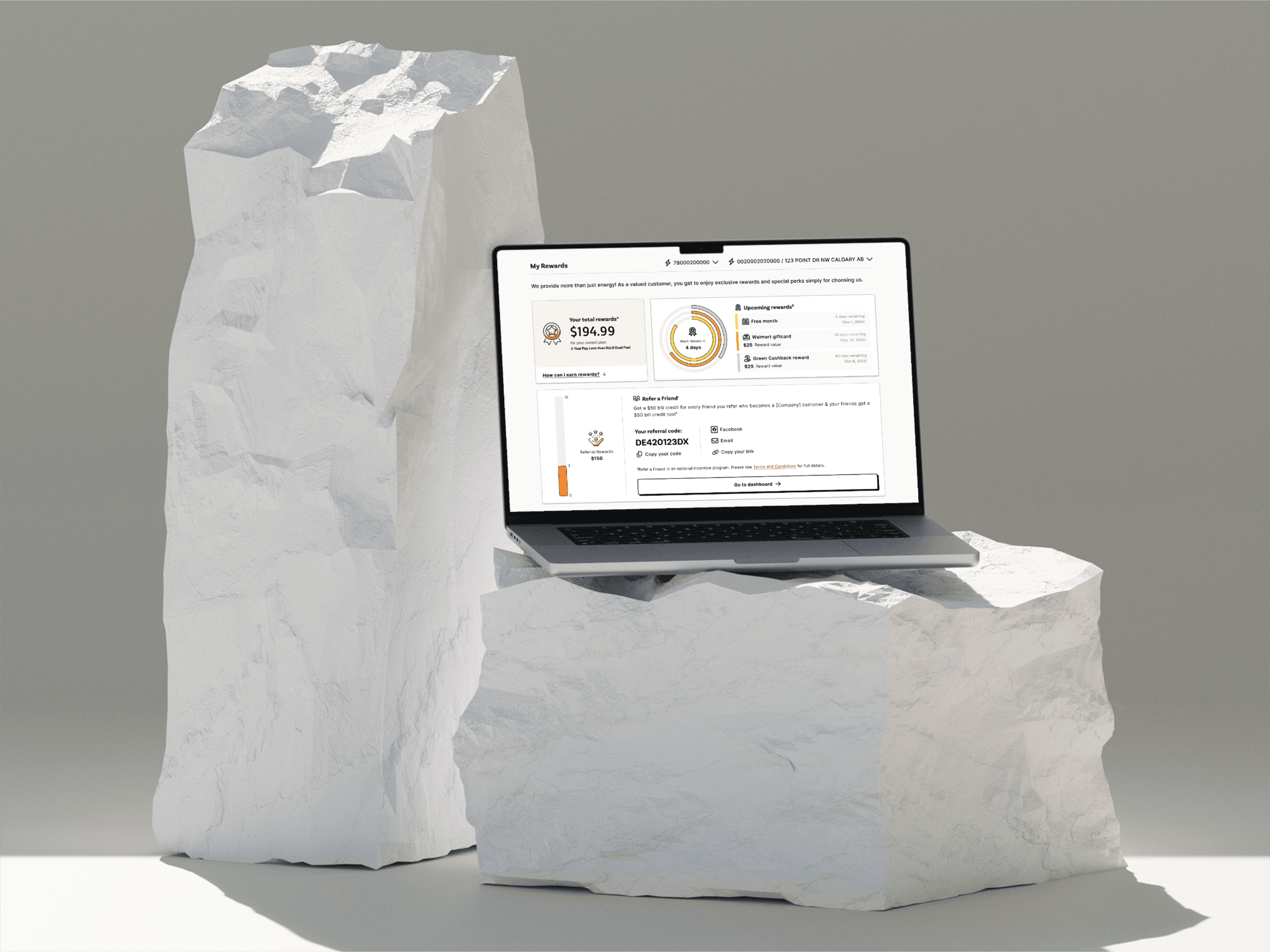
My Rewards dashboard in the new brand

2023-2024

Direct Energy Canada Rebrand

Rebranding a website is easy. Rebranding 600+ screens in a regulated market, without breaking a high-performing sales engine? That’s a different game.

Rebranding a website is easy. Rebranding 600+ screens in a regulated market, without breaking a high-performing sales engine? That’s a different game.

Overview

Rebranding is never easy, but when fundamental market differences exist across the brand’s operating regions, then localization of that rebranding effort (while maintaining consistency!) becomes a juggling act.

I led the Canadian website rebrand at Direct Energy, adapting a US-led brand system to Alberta’s highly regulated utilities market with very different products, constraints, and customer behaviour.

Over 12 months, I was responsible for translating the new brand across 600+ screens, leading a distributed design team, and ensuring Canada launched in parallel with the US rebrand, despite being brought into the conversation late.

Repainting when you’ve been given a new palette isn’t so bad. However, this project was more about balancing Canada’s business approach along with the Design System approach of creating cohesiveness. Sandwiched between these responsibilities I advocated for regional UX, and learned to push back on both sides while focusing on delivering that which our customers truly need without affecting conversion and sales goals.

Overview

Rebranding is never easy, but when fundamental market differences exist across the brand’s operating regions, then localization of that rebranding effort (while maintaining consistency!) becomes a juggling act.

I led the Canadian website rebrand at Direct Energy, adapting a US-led brand system to Alberta’s highly regulated utilities market with very different products, constraints, and customer behaviour.

Over 12 months, I was responsible for translating the new brand across 600+ screens, leading a distributed design team, and ensuring Canada launched in parallel with the US rebrand, despite being brought into the conversation late.

Repainting when you’ve been given a new palette isn’t so bad. However, this project was more about balancing Canada’s business approach along with the Design System approach of creating cohesiveness. Sandwiched between these responsibilities I advocated for regional UX, and learned to push back on both sides while focusing on delivering that which our customers truly need without affecting conversion and sales goals.

Site Map with Sprint Planning

I collaborated with the product manager and the technical dev lead to plan out sprints for all the various journeys for redesign.

Site Map with Sprint Planning

I collaborated with the product manager and the technical dev lead to plan out sprints for all the various journeys for redesign.

Context & Problem

The US rebranding efforts had considered Canada to simply be an extension of what they were already building, but that was not the case.

Unlike US markets, Canada:

  • sells both electricity and natural gas (vs electricity only in Texas markets)

  • has a government regulated market and a competitive, free-market for selling energy 

  • has a test-proven enrollment experience that uses a grid-based plan selection experience that consistently outperformed US’s card-based selection patterns

  • has stricter regulatory and disclosure requirements due to the nature of government involvement

So if were to blindly standardize the experience, which was the initial plan, it would have meant changing up our revenue-critical enrollment experience just for the sake of consistency, without even testing.

Sure our market wasn’t as big as US, but true localization efforts mean understanding your varying audiences and adapting your brand to work for them, not applying generic broad-sweeps.

Context & Problem

The US rebranding efforts had considered Canada to simply be an extension of what they were already building, but that was not the case.

Unlike US markets, Canada:

  • sells both electricity and natural gas (vs electricity only in Texas markets)

  • has a government regulated market and a competitive, free-market for selling energy 

  • has a test-proven enrollment experience that uses a grid-based plan selection experience that consistently outperformed US’s card-based selection patterns

  • has stricter regulatory and disclosure requirements due to the nature of government involvement

So if were to blindly standardize the experience, which was the initial plan, it would have meant changing up our revenue-critical enrollment experience just for the sake of consistency, without even testing.

Sure our market wasn’t as big as US, but true localization efforts mean understanding your varying audiences and adapting your brand to work for them, not applying generic broad-sweeps.

To get our designers up to speed on the current state of our journeys, a reference library of all the screens in each journey were screenshotted. These also served as references to translate all the existing functionality over into the new brand.

Legacy Reference Screens

To get our designers up to speed on the current state of our journeys, a reference library of all the screens in each journey were screenshotted. These also served as references to translate all the existing functionality over into the new brand.

Legacy Reference Screens
Component Library

An overview and organization of our new component library in Figma.

Component Library

An overview and organization of our new component library in Figma.

The old hero design fought for attention with two CTAs, the newer redesign focused in on one. The login CTA was removed and made more prominent on the sticky navigation at the top instead. Button designs were also all over the place before, such as a squared green non-stroke button, and a rounded white-stroke blue button, both existing together!

The old hero design fought for attention with two CTAs, the newer redesign focused in on one. The login CTA was removed and made more prominent on the sticky navigation at the top instead. Button designs were also all over the place before, such as a squared green non-stroke button, and a rounded white-stroke blue button, both existing together!

Role & Constraints

I acted as Lead Designer for Canada,

  • owning design for Online Enrollment, the core sales journey

  • directing execution for Online Account Management, the largest surface area

  • managing and mentoring two contract designers, onshore and offshore

  • representing Canadian requirements in US-Canada design system discussions

  • planning timelines to stay two sprints ahead of development

Key constraints:

  • Canada joined the rebrand late - we had to play catchup

  • Thus, timelines were compressed and there was pressure to deliver without much contingency

  • While US templates existed, due to the nature of our varying audiences we had to recreate our existing UX in the new brand

  • All designs had to be reviewed by the legal and compliance stakeholders, so I had to account for that approval time as part of the process

Role & Constraints

I acted as Lead Designer for Canada,

  • owning design for Online Enrollment, the core sales journey

  • directing execution for Online Account Management, the largest surface area

  • managing and mentoring two contract designers, onshore and offshore

  • representing Canadian requirements in US-Canada design system discussions

  • planning timelines to stay two sprints ahead of development

Key constraints:

  • Canada joined the rebrand late - we had to play catchup

  • Thus, timelines were compressed and there was pressure to deliver without much contingency

  • While US templates existed, due to the nature of our varying audiences we had to recreate our existing UX in the new brand

  • All designs had to be reviewed by the legal and compliance stakeholders, so I had to account for that approval time as part of the process

As our rebrand was done before variables and tokens were introduced to Figma, we went back to move over our styles into variables for better flexibility going forward.

Variable System Adopted Later On

As our rebrand was done before variables and tokens were introduced to Figma, we went back to move over our styles into variables for better flexibility going forward.

Variable System Adopted Later On

Key Insights

A few realities shaped every decision:

  • Proven UX patterns mattered more than visual consistency across regions

  • The design system needed extension, not enforcement

  • Speed without correctness would create downstream rework

  • Alignment across UX, Product, Marketing, and Legal mattered as much as design quality

This reframed the work from “adapting screens” to protecting outcomes.

Key Insights

A few realities shaped every decision:

  • Proven UX patterns mattered more than visual consistency across regions

  • The design system needed extension, not enforcement

  • Speed without correctness would create downstream rework

  • Alignment across UX, Product, Marketing, and Legal mattered as much as design quality

This reframed the work from “adapting screens” to protecting outcomes.

Illustrated Icons

A collage of our new illustrated icons.

Illustrated Icons

A collage of our new illustrated icons.

The dashboard was modernized, and each element was given more room to breathe. All functionality was translated over, while adding a level of improved UX. Keep in mind however, major functional changes were still restricted due to the constraints of the scope of the project.

The dashboard was modernized, and each element was given more room to breathe. All functionality was translated over, while adding a level of improved UX. Keep in mind however, major functional changes were still restricted due to the constraints of the scope of the project.

Decisions & Tradeoffs

I made several deliberate calls:

  • Preserved grid-based enrollment where data showed strong performance, even when it diverged from US patterns

  • Extended the design system instead of forking it, maintaining global alignment without sacrificing local needs

  • Pushed for adding a new brand-aligned green to the palette, enabling green products and initiatives to have a distinct visual identity beyond success-state usage.

  • Prioritized template-driven execution to quickly scale across 600+ screens

  • Chose momentum over perfection in lower-risk areas to protect high-impact journeys

Each decision traded short-term visual consistency for long-term performance and delivery confidence.

Decisions & Tradeoffs

I made several deliberate calls:

  • Preserved grid-based enrollment where data showed strong performance, even when it diverged from US patterns

  • Extended the design system instead of forking it, maintaining global alignment without sacrificing local needs

  • Pushed for adding a new brand-aligned green to the palette, enabling green products and initiatives to have a distinct visual identity beyond success-state usage.

  • Prioritized template-driven execution to quickly scale across 600+ screens

  • Chose momentum over perfection in lower-risk areas to protect high-impact journeys

Each decision traded short-term visual consistency for long-term performance and delivery confidence.

Documentation was important in setting up the new design system to ensure all designers had a source of truth in how to utilize our components with consistency. It also helped with development work in detailing various parameters (sizing, colours, strokes, shadows, etc.) and interaction states of the components.

Documenting Component Usage

Documentation was important in setting up the new design system to ensure all designers had a source of truth in how to utilize our components with consistency. It also helped with development work in detailing various parameters (sizing, colours, strokes, shadows, etc.) and interaction states of the components.

Documenting Component Usage

Execution Highlights

  • Translated the US brand system across 600+ Canadian screens

  • Built reusable templates to accelerate production and reduce dev churn

  • Ran frequent design check-ins to unblock teams, create visual alignment and align stakeholders

  • Stayed ahead of development to avoid late-stage rework

Execution stayed grounded in user behaviour, regulatory constraints, and business impact, not aesthetic preference.

Execution Highlights

  • Translated the US brand system across 600+ Canadian screens

  • Built reusable templates to accelerate production and reduce dev churn

  • Ran frequent design check-ins to unblock teams, create visual alignment and align stakeholders

  • Stayed ahead of development to avoid late-stage rework

Execution stayed grounded in user behaviour, regulatory constraints, and business impact, not aesthetic preference.

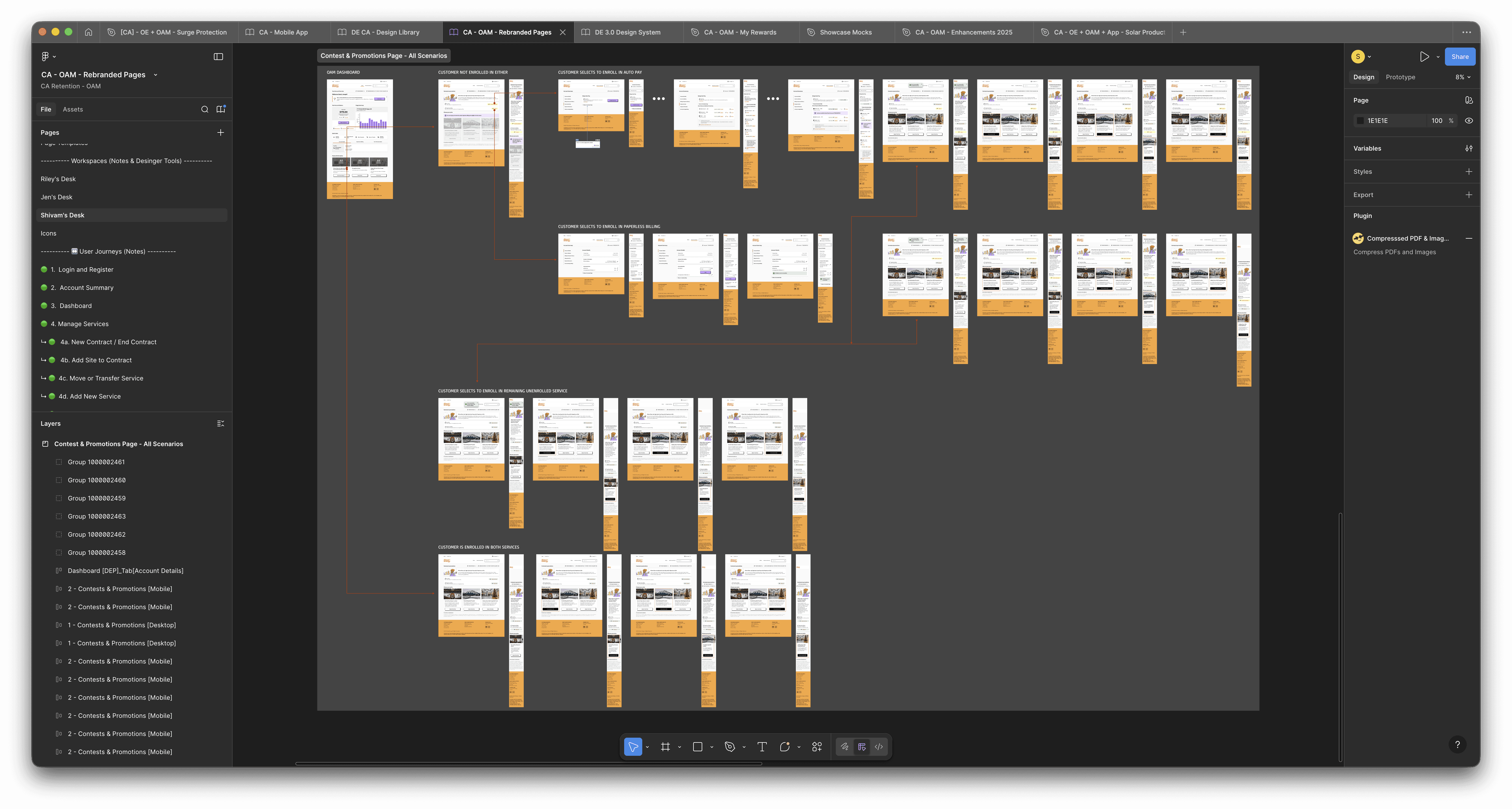
Mapping Journeys

Laying out journeys in a chronological format allowed non designers to jump in and follow-along with ease. This was especially helpful for stakeholder discussions and for the development team to reference the various interactions & scenarios.

Mapping Journeys

Laying out journeys in a chronological format allowed non designers to jump in and follow-along with ease. This was especially helpful for stakeholder discussions and for the development team to reference the various interactions & scenarios.

Outcomes

  • Launched Canada in sync with the US rebrand, despite late inclusion

  • Retained a high-performing enrollment experience

  • Sped up development timelines by ensuring edge-case and error scenarios were included through early alignment

  • Influenced broader thinking around regional flexibility within the design system

  • Our well-converting (average of 5.8-7% CVR) grid-selector style Online Enrollment experience success got even our competitors adopting similar enrollment patterns

Outcomes

  • Launched Canada in sync with the US rebrand, despite late inclusion

  • Retained a high-performing enrollment experience

  • Sped up development timelines by ensuring edge-case and error scenarios were included through early alignment

  • Influenced broader thinking around regional flexibility within the design system

  • Our well-converting (average of 5.8-7% CVR) grid-selector style Online Enrollment experience success got even our competitors adopting similar enrollment patterns

Reflection

This project reshaped how I think about systems and leadership.

I stopped treating design systems as static rulebooks and started treating them as living frameworks that must adapt to context. I also became more deliberate about when to push, when to compromise, and how to frame decisions in terms of impact, not opinion.

Most importantly, I learned that design leadership happens before Figma opens. Alignment and trust make execution possible.

Reflection

This project reshaped how I think about systems and leadership.

I stopped treating design systems as static rulebooks and started treating them as living frameworks that must adapt to context. I also became more deliberate about when to push, when to compromise, and how to frame decisions in terms of impact, not opinion.

Most importantly, I learned that design leadership happens before Figma opens. Alignment and trust make execution possible.

Good ideas usually start as half-formed thoughts.

Tell me about yours.

Good ideas usually start as half-formed thoughts.

Tell me about yours.

Good ideas usually start as half-formed thoughts.

Tell me about yours.

Create a free website with Framer, the website builder loved by startups, designers and agencies.