
2022
Employment Law UX Audit
People don’t visit a law firm’s website to read bios. They come to see if you can solve their problem. When clarity drops, so does conversion.
People don’t visit a law firm’s website to read bios. They come to see if you can solve their problem. When clarity drops, so does conversion.
Overview
Whitten & Lublin are employment lawyers that engaged me as a UX Strategist to evaluate why their website was underperforming despite investing in their website and marketing.
They weren’t trying to reinvent their website. What they wanted was a “UX Sherlock” with their repertoire of knowledge in UX principles, heuristics and information architecture, to help guide the direction in which to improve their conversion.
Overview
Whitten & Lublin are employment lawyers that engaged me as a UX Strategist to evaluate why their website was underperforming despite investing in their website and marketing.
They weren’t trying to reinvent their website. What they wanted was a “UX Sherlock” with their repertoire of knowledge in UX principles, heuristics and information architecture, to help guide the direction in which to improve their conversion.
Context & Problem
Severance and termination were common scenarios in their line of work, yet their website was seeing lower-than-expected conversion metrics. Their team shared that they wanted to reduce their higher bounce rates on critical pages. This all showed that while they were getting traffic onto their pages, something was causing making these potential clients feel that they were not getting what they came for quick enough or feel confident enough in continuing.
Remaking their website would be a big waste of their initial investment in making it, so the next best thing was to fix what seemed to have been broken. But what was broken? That’s where I stepped in to audit the site.
Context & Problem
Severance and termination were common scenarios in their line of work, yet their website was seeing lower-than-expected conversion metrics. Their team shared that they wanted to reduce their higher bounce rates on critical pages. This all showed that while they were getting traffic onto their pages, something was causing making these potential clients feel that they were not getting what they came for quick enough or feel confident enough in continuing.
Remaking their website would be a big waste of their initial investment in making it, so the next best thing was to fix what seemed to have been broken. But what was broken? That’s where I stepped in to audit the site.
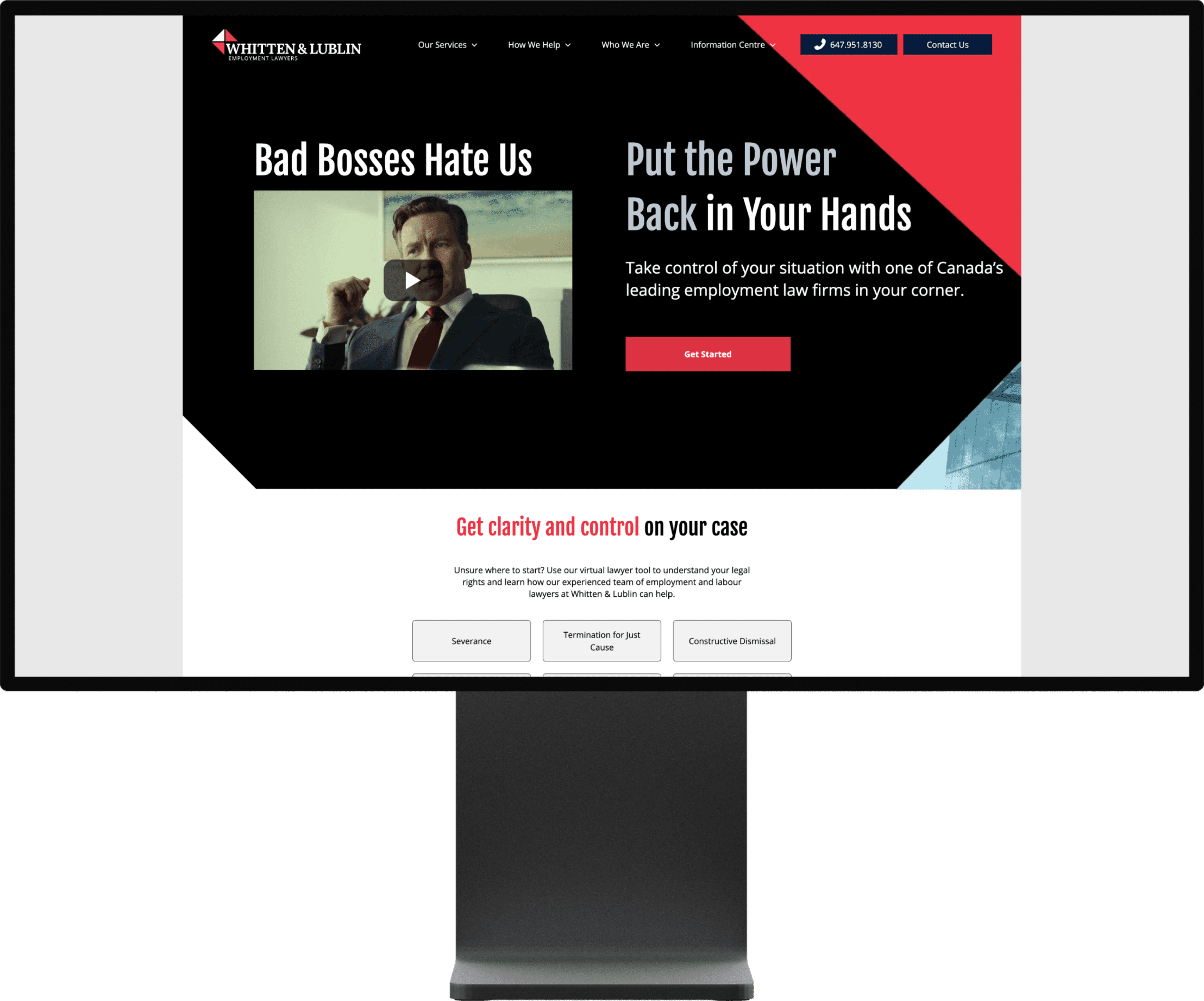
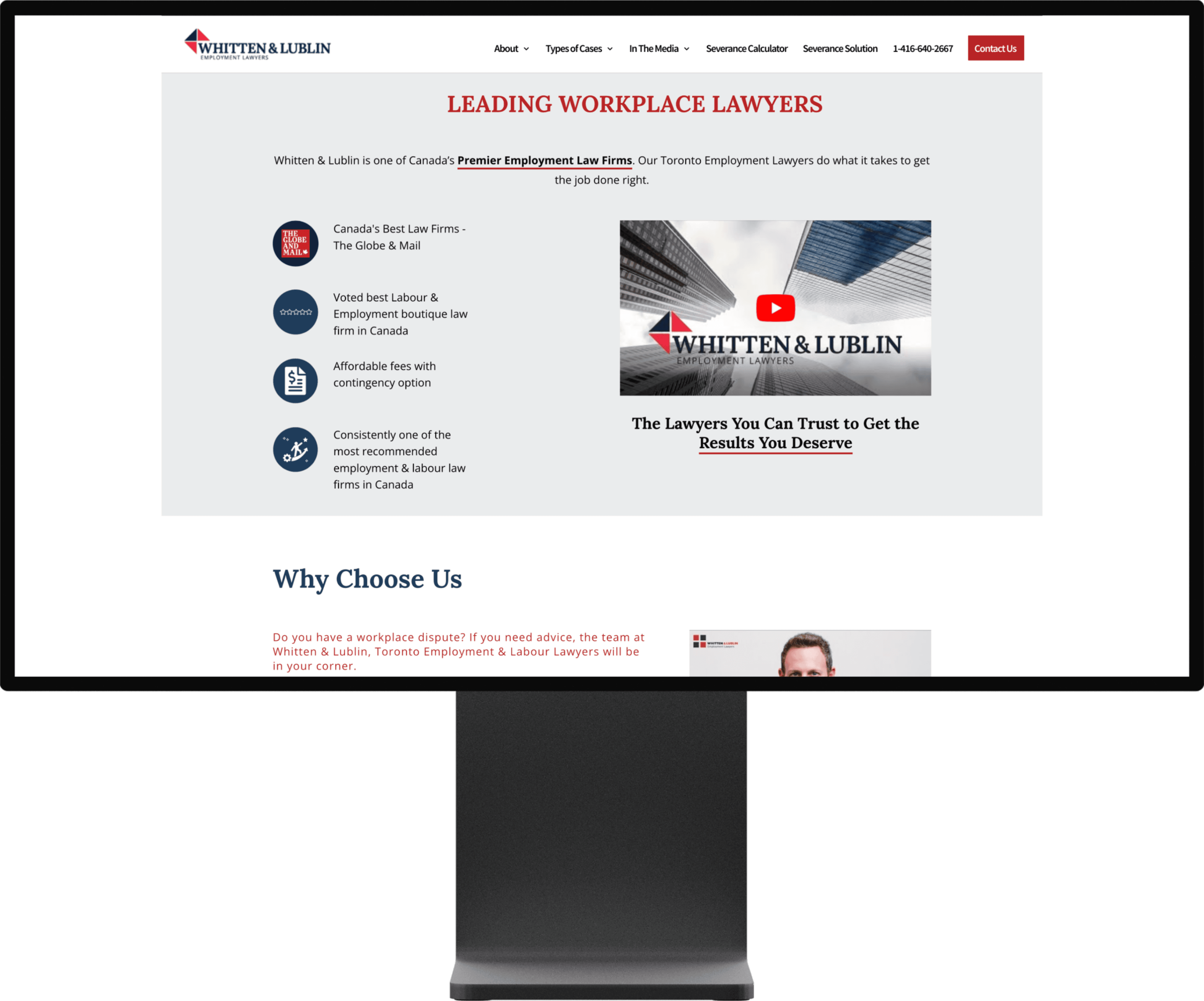
Homepage: From Brand-Led to Problem-Led
The original homepage leaned heavily on credentials, awards, and firm positioning. While credible, it required users to work too hard to understand whether their specific employment issue was something the firm could actually help with. Key actions were visually present, but not meaningfully prioritised, and the overall hierarchy made scanning difficult for users arriving in a moment of stress.
The updated homepage reframed the experience around user problems first, clearly surfacing common employment scenarios and guiding visitors toward immediate next steps. Strong contrast, simplified hierarchy, and focused calls to action reduced cognitive load and made it easier for users to self-identify their situation and move forward with confidence.
Homepage: From Brand-Led to Problem-Led
The original homepage leaned heavily on credentials, awards, and firm positioning. While credible, it required users to work too hard to understand whether their specific employment issue was something the firm could actually help with. Key actions were visually present, but not meaningfully prioritised, and the overall hierarchy made scanning difficult for users arriving in a moment of stress.
The updated homepage reframed the experience around user problems first, clearly surfacing common employment scenarios and guiding visitors toward immediate next steps. Strong contrast, simplified hierarchy, and focused calls to action reduced cognitive load and made it easier for users to self-identify their situation and move forward with confidence.
Role & Constraints
I was brought on as a UX Strategist, responsible for the audit.
My scope included:
Heuristic evaluation of the full website
Architecture and user flow assessment
Providing strategic recommendations for UX and conversion improvements, based on their target audience
Key constraints:
As with an audit, there was no scope of whether my recommendations would be implemented
The focus was on heuristics and UX patterns, so the existing brand and content had to be respected
Outcomes needed to be clear and actionable for future implementation
Role & Constraints
I was brought on as a UX Strategist, responsible for the audit.
My scope included:
Heuristic evaluation of the full website
Architecture and user flow assessment
Providing strategic recommendations for UX and conversion improvements, based on their target audience
Key constraints:
As with an audit, there was no scope of whether my recommendations would be implemented
The focus was on heuristics and UX patterns, so the existing brand and content had to be respected
Outcomes needed to be clear and actionable for future implementation
Key Insights
Several patterns emerged through analysis:
Users were not primarily interested in the firm’s background on arrival
They were seeking confirmation that their specific problem could be handled
Solutions were not clearly surfaced early enough in the journey
The “Severance Solution” page had a markedly different visual treatment, which unintentionally reduced perceived value and professionalism
Basically, the site was talking about itself before proving relevance to the user’s problem.
Key Insights
Several patterns emerged through analysis:
Users were not primarily interested in the firm’s background on arrival
They were seeking confirmation that their specific problem could be handled
Solutions were not clearly surfaced early enough in the journey
The “Severance Solution” page had a markedly different visual treatment, which unintentionally reduced perceived value and professionalism
Basically, the site was talking about itself before proving relevance to the user’s problem.
Severance Calculator: From Information-Heavy to Action-Oriented
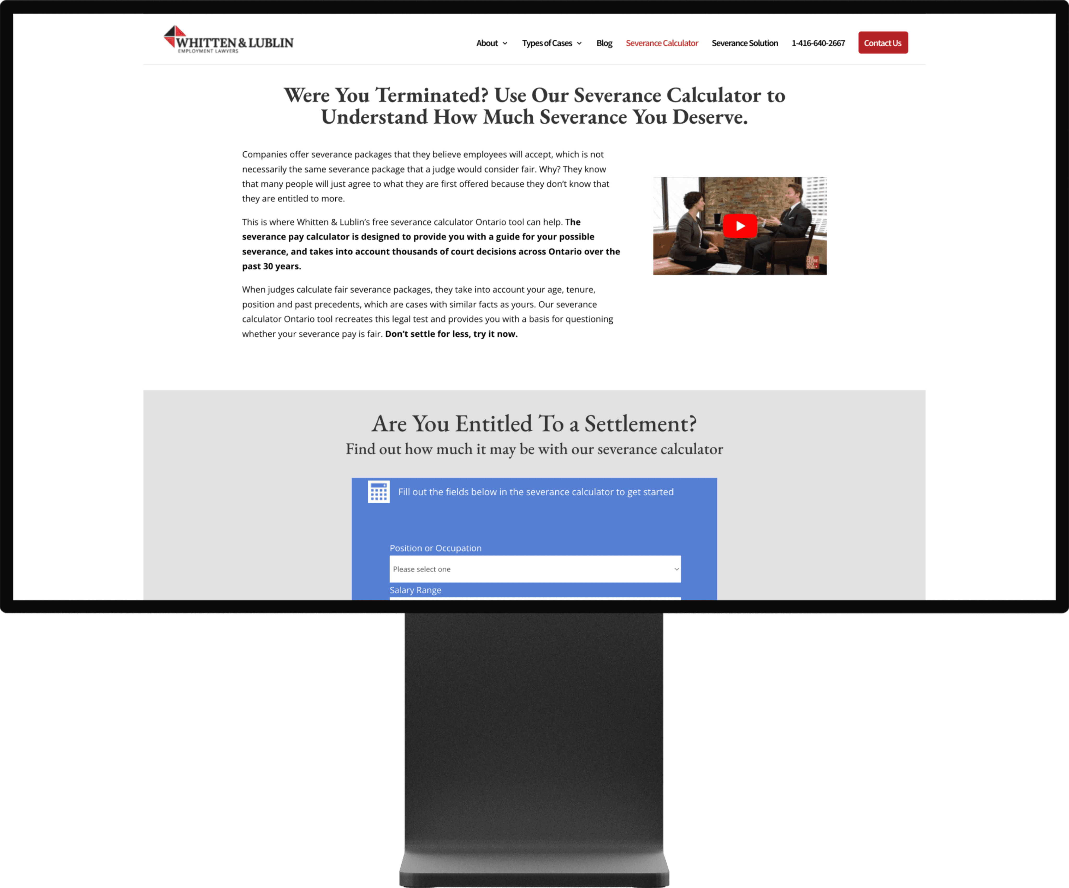
The original Severance Calculator page relied on long-form explanations to establish credibility, but the density and placement of content created friction before users could take action. The core value of the tool was buried beneath paragraphs of legal context, making it harder for users to quickly understand what the calculator did and how it could help their specific situation.
The updated experience re-centred the page around immediate utility and clarity, clearly framing the calculator as a way to take control of an uncertain outcome. Content was tightened, hierarchy was simplified, and the primary interaction was brought forward, allowing users to engage with the tool quickly while still reinforcing trust through supporting context rather than overwhelming explanation.
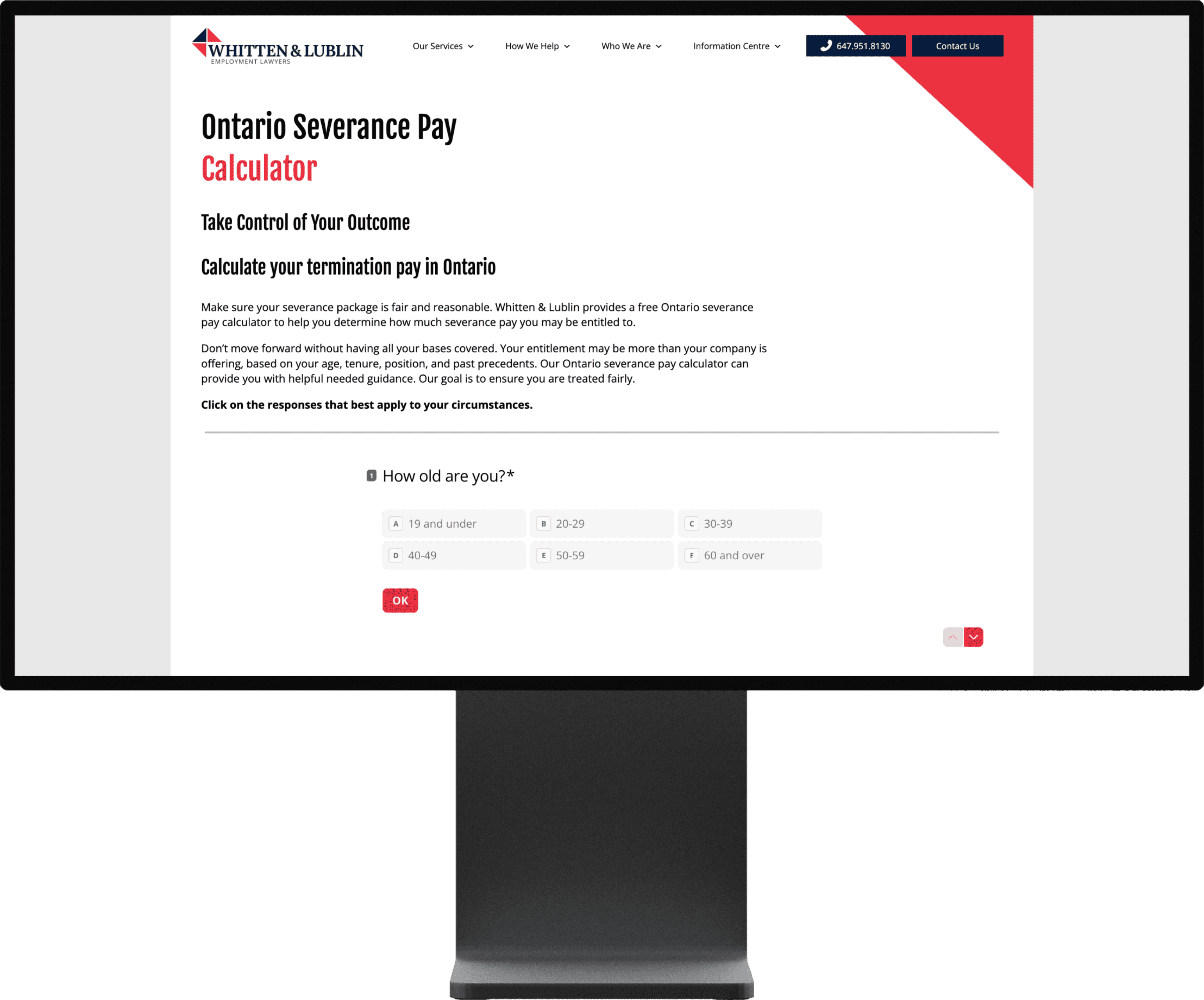
Severance Calculator: From Information-Heavy to Action-Oriented
The original Severance Calculator page relied on long-form explanations to establish credibility, but the density and placement of content created friction before users could take action. The core value of the tool was buried beneath paragraphs of legal context, making it harder for users to quickly understand what the calculator did and how it could help their specific situation.
The updated experience re-centred the page around immediate utility and clarity, clearly framing the calculator as a way to take control of an uncertain outcome. Content was tightened, hierarchy was simplified, and the primary interaction was brought forward, allowing users to engage with the tool quickly while still reinforcing trust through supporting context rather than overwhelming explanation.
Decisions & Tradeoffs
The audit prioritised clarity and coherence over surface-level polish.
Key recommendations included:
Re-centering the experience around problems the firm solves, not so much "who we are"
Reordering content to lead with value - meaning moving up tools like the severance calculator, then following with legal expertise
Establishing stronger visual and structural cohesion across high-intent pages
Reducing content density and improving hierarchy to support scanning and comprehension
Treating the contact us box as a primary UX flow, the details matter
The tradeoff was resisting the temptation to redesign everything, and instead focusing on high-leverage structural changes.
Decisions & Tradeoffs
The audit prioritised clarity and coherence over surface-level polish.
Key recommendations included:
Re-centering the experience around problems the firm solves, not so much "who we are"
Reordering content to lead with value - meaning moving up tools like the severance calculator, then following with legal expertise
Establishing stronger visual and structural cohesion across high-intent pages
Reducing content density and improving hierarchy to support scanning and comprehension
Treating the contact us box as a primary UX flow, the details matter
The tradeoff was resisting the temptation to redesign everything, and instead focusing on high-leverage structural changes.
Execution Highlights
Conducted a heuristic evaluation across key pages and flows
Mapped user intent against existing architecture
Analysed bounce rates and behavioural patterns to infer friction points
Provided clear, prioritised guidance tied directly to user needs and business goals
Framed recommendations in a way that could be incrementally implemented
The output was a strategic UX blueprint, not just a list of issues.
Execution Highlights
Conducted a heuristic evaluation across key pages and flows
Mapped user intent against existing architecture
Analysed bounce rates and behavioural patterns to infer friction points
Provided clear, prioritised guidance tied directly to user needs and business goals
Framed recommendations in a way that could be incrementally implemented
The output was a strategic UX blueprint, not just a list of issues.
Severance Solution: From Fragmented Presentation to Cohesive, Trust-Led Design
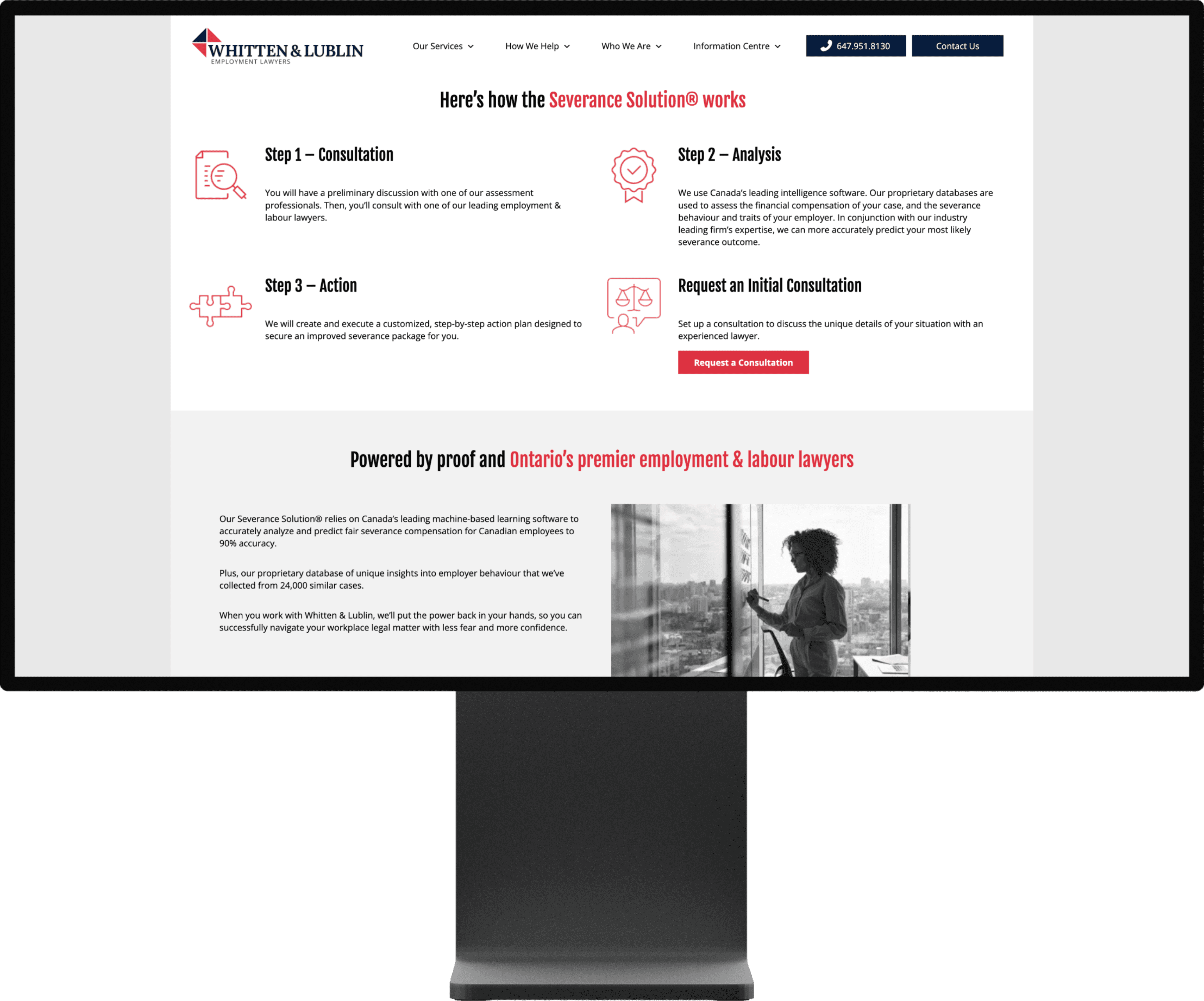
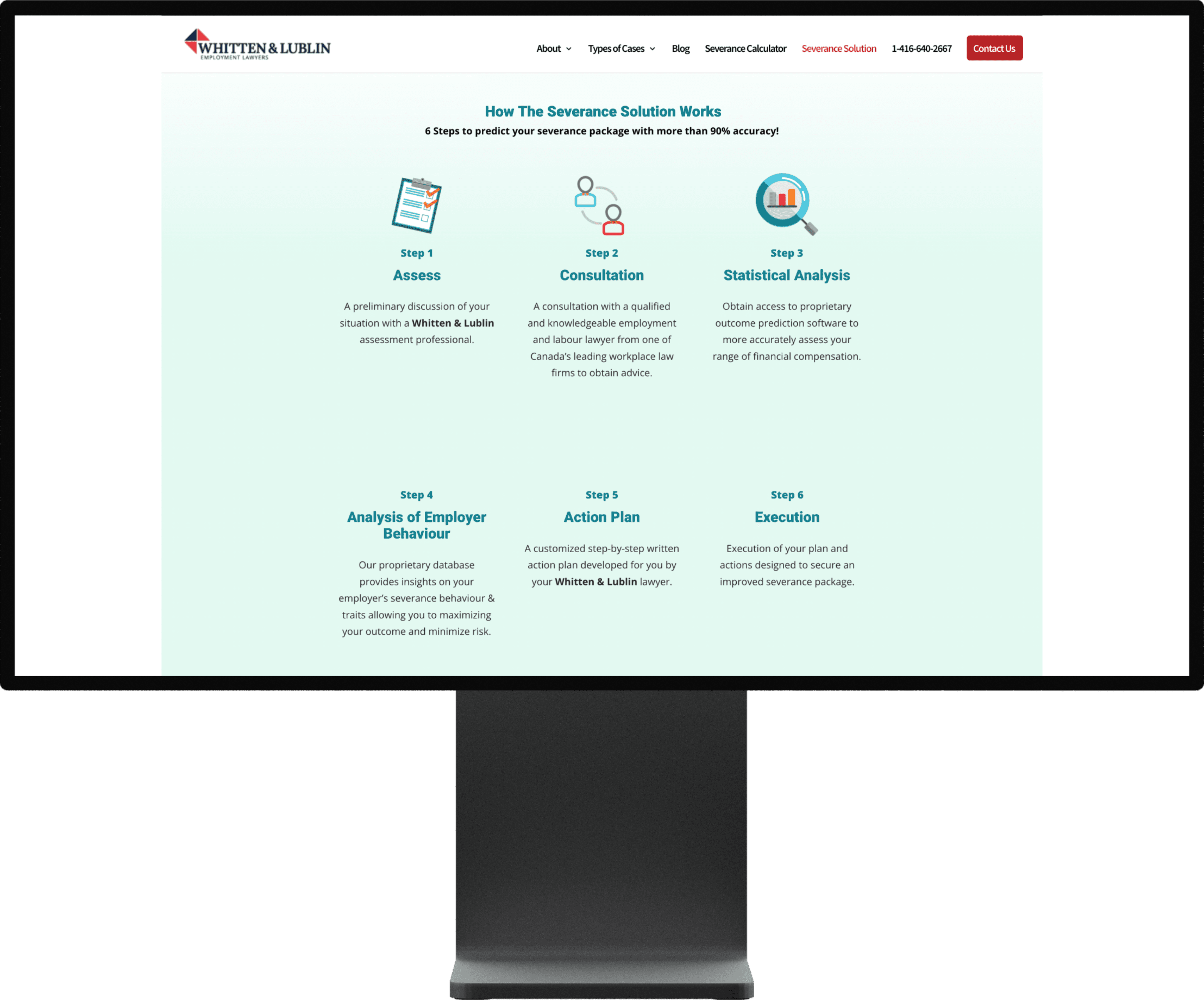
The original Severance Solution page attempted to explain the firm’s process in detail, but the six-step breakdown introduced unnecessary complexity and cognitive load. Additionally, the use of colours and visual treatments that did not appear elsewhere on the site made the page feel disconnected from the broader brand, unintentionally reducing perceived professionalism and trust.
The updated version simplified the narrative into a clear, outcome-oriented flow, while realigning visual language with the rest of the site. By reducing steps, tightening copy, and restoring brand cohesion, the experience made the solution feel more credible and accessible, guiding users more confidently toward initiating a consultation.
Severance Solution: From Fragmented Presentation to Cohesive, Trust-Led Design
The original Severance Solution page attempted to explain the firm’s process in detail, but the six-step breakdown introduced unnecessary complexity and cognitive load. Additionally, the use of colours and visual treatments that did not appear elsewhere on the site made the page feel disconnected from the broader brand, unintentionally reducing perceived professionalism and trust.
The updated version simplified the narrative into a clear, outcome-oriented flow, while realigning visual language with the rest of the site. By reducing steps, tightening copy, and restoring brand cohesion, the experience made the solution feel more credible and accessible, guiding users more confidently toward initiating a consultation.
Outcomes
Delivered clear direction on the website’s primary UX shortcomings
Helped realign the experience around services, credibility, and ease of contact
Provided actionable guidance connecting user intent, business goals, and design decisions
The firm’s current website reflects stronger cohesion, hierarchy, and professional clarity
While conversion metrics were not shared, these improvements addressed the main friction points found through analytics and heuristic analysis.
Outcomes
Delivered clear direction on the website’s primary UX shortcomings
Helped realign the experience around services, credibility, and ease of contact
Provided actionable guidance connecting user intent, business goals, and design decisions
The firm’s current website reflects stronger cohesion, hierarchy, and professional clarity
While conversion metrics were not shared, these improvements addressed the main friction points found through analytics and heuristic analysis.
Reflection
This project reinforced within me the value of diagnosis before design.
What worked well
Heuristic analysis cuts through subjective feedback, there are proven principles that help guide better UX and conversion
Grounding recommendations in real user intent rather than assumptions
Treating brand cohesion and UX clarity as credibility signals
What I’d improve next time
Defining success metrics to better measure post-implementation impact
Deeper collaboration with development during recommendation planning
This work strengthened my approach to strategic UX, service clarity, and conversion-focused thinking, especially in professional and trust-based domains.
Reflection
This project reinforced within me the value of diagnosis before design.
What worked well
Heuristic analysis cuts through subjective feedback, there are proven principles that help guide better UX and conversion
Grounding recommendations in real user intent rather than assumptions
Treating brand cohesion and UX clarity as credibility signals
What I’d improve next time
Defining success metrics to better measure post-implementation impact
Deeper collaboration with development during recommendation planning
This work strengthened my approach to strategic UX, service clarity, and conversion-focused thinking, especially in professional and trust-based domains.
Good ideas usually start as half-formed thoughts.
Tell me about yours.
Good ideas usually start as half-formed thoughts.
Tell me about yours.
Good ideas usually start as half-formed thoughts.
Tell me about yours.