
2022
Hug Again
How do you design for trust when the topic is sensitive, the audience is vulnerable, and promotion isn’t allowed?
How do you design for trust when the topic is sensitive, the audience is vulnerable, and promotion isn’t allowed?
Overview
It was COVID time and there were many solutions floating about on how to support people of all age groups and health conditions. So what about immunocompromised individuals that may be at higher risk?
Cue, Hug Again - an unbranded direct-to-consumer health awareness website designed to help these folks understand COVID-19 prevention options and feel more confident initiating conversations with their doctors.
I was brought on as a contract UX Designer supporting a large, global pharmaceutical organisation to help create an easy-to-engage experience for generally older individuals that rely on trust, and accessible use.
The experience was intentionally unbranded, balancing public health education with strict health and legal and compliance requirements.
Overview
It was COVID time and there were many solutions floating about on how to support people of all age groups and health conditions. So what about immunocompromised individuals that may be at higher risk?
Cue, Hug Again - an unbranded direct-to-consumer health awareness website designed to help these folks understand COVID-19 prevention options and feel more confident initiating conversations with their doctors.
I was brought on as a contract UX Designer supporting a large, global pharmaceutical organisation to help create an easy-to-engage experience for generally older individuals that rely on trust, and accessible use.
The experience was intentionally unbranded, balancing public health education with strict health and legal and compliance requirements.
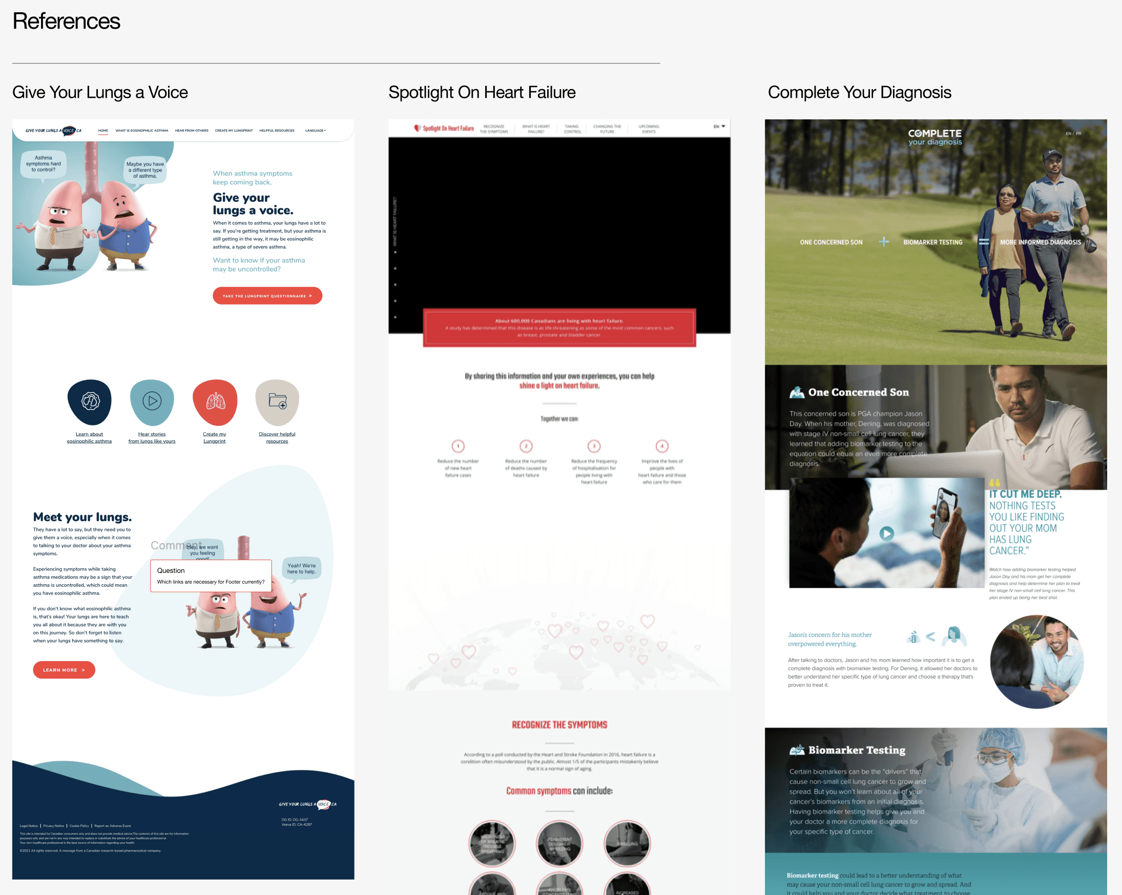
Unbranded sites have to follow strict guidelines and have to remain unbiased in providing information. To get up to speed on these practices three other unbranded sites were researched.
Unbranded sites have to follow strict guidelines and have to remain unbiased in providing information. To get up to speed on these practices three other unbranded sites were researched.
Context & Problem
While it’s natural to think that a big pharmaceutical company would want to sneak-in their solution, there are very strict regulations to prevent such underlying ‘dark pattern’ behaviour itself. These unbranded websites are scrutinized to ensure that you can only recommend the target audience to talk to your doctor about what is out there for solutions. So really the focus is about creating a campaign of awareness.
The challenge in this was,
ensuring that the experience maintained an unbiased tone that focused on the target audience’s lifestyle with being immunocompromised.
involving the legal and compliance stakeholders from an early point to ensure all content, even wireframes, were approved for adherence to those strict legal and regulatory requirements
ensuring that the target audience that skewed older and less digitally confident, was made to feel confident to use the site. And,
that the primary goal was education and conversation-starting, not conversion
This was an unusual problem to solve for because usually as designers we're brought in to increase sales metrics and push towards business growth. This felt like a more indirect approach.
Context & Problem
While it’s natural to think that a big pharmaceutical company would want to sneak-in their solution, there are very strict regulations to prevent such underlying ‘dark pattern’ behaviour itself. These unbranded websites are scrutinized to ensure that you can only recommend the target audience to talk to your doctor about what is out there for solutions. So really the focus is about creating a campaign of awareness.
The challenge in this was,
ensuring that the experience maintained an unbiased tone that focused on the target audience’s lifestyle with being immunocompromised.
involving the legal and compliance stakeholders from an early point to ensure all content, even wireframes, were approved for adherence to those strict legal and regulatory requirements
ensuring that the target audience that skewed older and less digitally confident, was made to feel confident to use the site. And,
that the primary goal was education and conversation-starting, not conversion
This was an unusual problem to solve for because usually as designers we're brought in to increase sales metrics and push towards business growth. This felt like a more indirect approach.
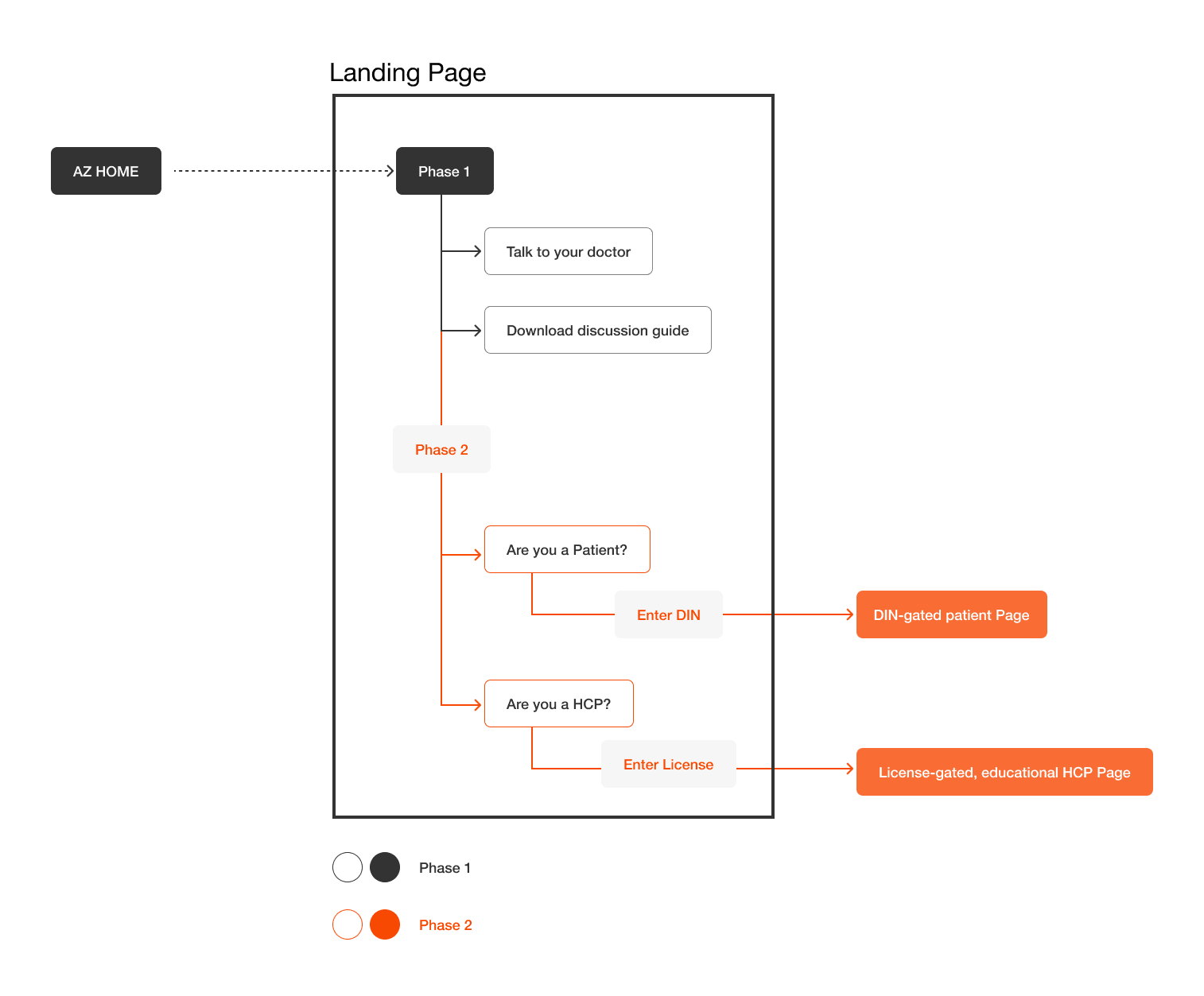
As part of a phased launch approach of the product, this site served as a Phase 1 - helping immunocompromised individuals understand being informed of solutions out there for COVID-19.
As part of a phased launch approach of the product, this site served as a Phase 1 - helping immunocompromised individuals understand being informed of solutions out there for COVID-19.
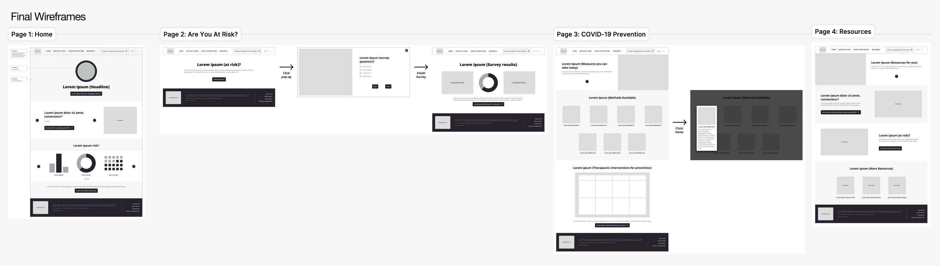
The site was designed to be easy to navigate and digest for the target audience that skewed older. These wireframes served as the underlying layer for the website.
The site was designed to be easy to navigate and digest for the target audience that skewed older. These wireframes served as the underlying layer for the website.
Role & Constraints
I worked as a contract UX Designer, collaborating closely with:
Legal and compliance stakeholders
Marketing partners
A graphic designer responsible for visual execution
My responsibilities included:
Creating desktop and mobile wireframes
Architecting the site map
Translating provided primary and secondary research insights into usable layouts for the older target audience
Preparing designs with context for handoff to the graphic designer
Key constraints:
Timelines were tight, I had two weeks to deliver following audience research
Fixed, pre-approved content was provided, I had to create the space for it to be visually placed
No design direction could hint at product naming or branded visual language
Accessibility and readability were non-negotiable, especially with that targeted older demographic
Role & Constraints
I worked as a contract UX Designer, collaborating closely with:
Legal and compliance stakeholders
Marketing partners
A graphic designer responsible for visual execution
My responsibilities included:
Creating desktop and mobile wireframes
Architecting the site map
Translating provided primary and secondary research insights into usable layouts for the older target audience
Preparing designs with context for handoff to the graphic designer
Key constraints:
Timelines were tight, I had two weeks to deliver following audience research
Fixed, pre-approved content was provided, I had to create the space for it to be visually placed
No design direction could hint at product naming or branded visual language
Accessibility and readability were non-negotiable, especially with that targeted older demographic
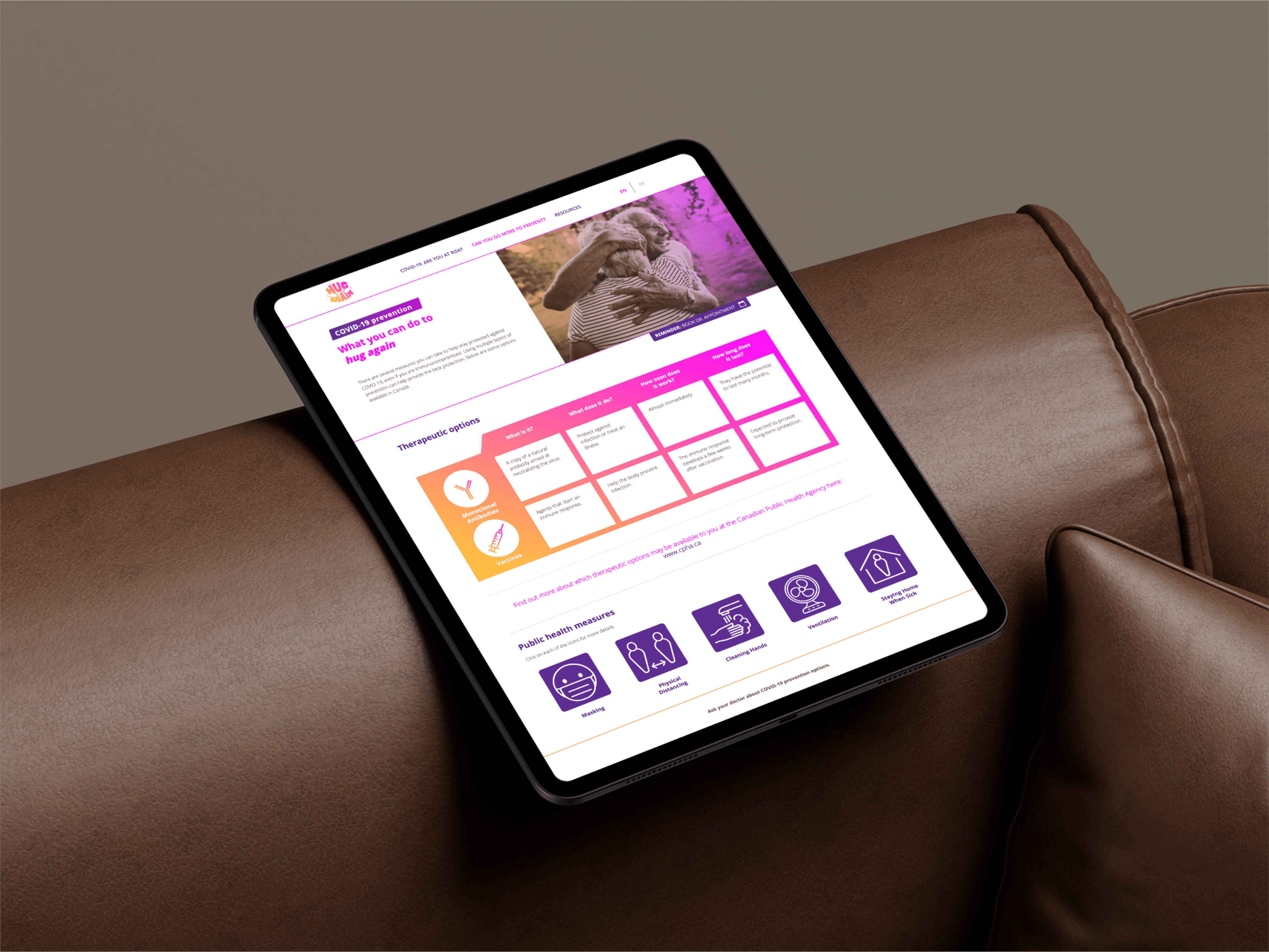
The Hug Again logo was created by the graphic design team to invoke feelings of hope and warmth - at a time when human contact was difficult.
The Hug Again logo was created by the graphic design team to invoke feelings of hope and warmth - at a time when human contact was difficult.
Key Insights
Audience research indicated that:
Many users lacked confidence navigating complex and content-dense websites
Large tap targets and predictable navigation reduced anxiety
Clear hierarchy and restrained interactivity increased trust
Users valued tools that helped them ask better questions, rather than make decisions independently
A core insight was that confidence and reassurance mattered more than depth.
Key Insights
Audience research indicated that:
Many users lacked confidence navigating complex and content-dense websites
Large tap targets and predictable navigation reduced anxiety
Clear hierarchy and restrained interactivity increased trust
Users valued tools that helped them ask better questions, rather than make decisions independently
A core insight was that confidence and reassurance mattered more than depth.
Decisions & Tradeoffs
Several deliberate decisions shaped the experience:
Designed for simplicity over density, even when more content was available
Prioritised large buttons, clear hierarchy, and minimal interaction complexity
Structured the site as a guided flow rather than open exploration
Focused on downloadable discussion tools to support offline doctor conversations
Accepted limited interactivity to reduce cognitive load
These choices traded visual sophistication for clarity, trust, and accessibility, which aligned with both the audience and regulatory context.
Decisions & Tradeoffs
Several deliberate decisions shaped the experience:
Designed for simplicity over density, even when more content was available
Prioritised large buttons, clear hierarchy, and minimal interaction complexity
Structured the site as a guided flow rather than open exploration
Focused on downloadable discussion tools to support offline doctor conversations
Accepted limited interactivity to reduce cognitive load
These choices traded visual sophistication for clarity, trust, and accessibility, which aligned with both the audience and regulatory context.
Execution Highlights
Defined site structure around clear objectives: who it’s for, what it does, and why it exists
Architected content across multiple pages to support progressive understanding
Designed an interactive risk survey to personalise learning without collecting sensitive data
Delivered desktop and mobile wireframes ready for visual branding and development
Conducted secondary research on successful unbranded DTC health campaigns to inform structure and tone
The wireframes served as the UX foundation for visual design and build.
Execution Highlights
Defined site structure around clear objectives: who it’s for, what it does, and why it exists
Architected content across multiple pages to support progressive understanding
Designed an interactive risk survey to personalise learning without collecting sensitive data
Delivered desktop and mobile wireframes ready for visual branding and development
Conducted secondary research on successful unbranded DTC health campaigns to inform structure and tone
The wireframes served as the UX foundation for visual design and build.
Outcomes
The website launched successfully and remains live today, continuing to guide immunocompromised individuals toward informed healthcare conversations
Delivery timelines were met without issue despite tight schedules
Stakeholders across legal, marketing, and design aligned efficiently due to clear structure and intent
While quantitative performance data was not shared due to the nature of the contract, the work demonstrated how thoughtful UX can responsibly support sensitive health topics within strict constraints.
Outcomes
The website launched successfully and remains live today, continuing to guide immunocompromised individuals toward informed healthcare conversations
Delivery timelines were met without issue despite tight schedules
Stakeholders across legal, marketing, and design aligned efficiently due to clear structure and intent
While quantitative performance data was not shared due to the nature of the contract, the work demonstrated how thoughtful UX can responsibly support sensitive health topics within strict constraints.
Reflection
This project reinforced the importance of restraint, clarity, and collaboration in regulated design work.
What worked well
Grounding every decision in audience capability and comfort
Treating legal and compliance partners as design collaborators
Using structure and hierarchy to build trust without persuasion
What I’d improve next time
Earlier collaboration with visual design to streamline handoff
More opportunity for lightweight usability validation
Clearer success signals defined upfront, even when metrics are unavailable
Overall, this work strengthened my approach to ethical design, accessibility, and stakeholder alignment in highly sensitive domains.
Reflection
This project reinforced the importance of restraint, clarity, and collaboration in regulated design work.
What worked well
Grounding every decision in audience capability and comfort
Treating legal and compliance partners as design collaborators
Using structure and hierarchy to build trust without persuasion
What I’d improve next time
Earlier collaboration with visual design to streamline handoff
More opportunity for lightweight usability validation
Clearer success signals defined upfront, even when metrics are unavailable
Overall, this work strengthened my approach to ethical design, accessibility, and stakeholder alignment in highly sensitive domains.

Good ideas usually start as half-formed thoughts.
Tell me about yours.
Good ideas usually start as half-formed thoughts.
Tell me about yours.
Good ideas usually start as half-formed thoughts.
Tell me about yours.